#ShowYourStripes is a visualisation tool for showing the changing average temperature over the last ~150 years. You can go to their website and find “your” stripes – for your country or another one. Have a look at several countries. I found it interesting to compare New Zealand to Syria and the Central African Republic. I haven’t found a country yet that isn’t more red on the right and more blue on the left.
But, what does “average temperature” mean? Fortunately, almost all the data we have collected is made publicly available, for free. This means that we can all do our own research and understand what’s happening. Granted, some free data requires expert analysis, but “temperature” is a concept we can all understand (and many of us can measure ourselves in our own garden).
On the UK MetOffice website, you can access historical temperature records for anywhere in the country. I downloaded the data for Oxford and imported them into Microsoft Excel. The data look like this.

The first column is year, the second is month. What you then have are the average maximum temperature for all days in that month and the average minimum temperature for all nights in that month. It also gives the number of days with air frost, the total rainfall over the month in mm and the total hours of sunshine that month (from 1929 onwards).
The first thing I did was plot the data (this was almost as simple as it sounds – the only step I did was to create a year-month as a decimal year using the simple formula =YEAR+(MONTH-1)/12. When I had done that it looked like this:

Now, this plot shows us the first problem with observing any climate record – seasonal variations are always far larger than the climate trend you are looking for. And this is based on the monthly average of the maximum temperature. If we plotted daily maxima or hourly values it would be even more all over the place! This is why all observational data is “manipulated”. It’s impossible to see what you’re looking for in raw data – raw data variations are dominated by the diurnal cycle (night and day) and by seasonal cycles and by noisy weather. There are also longer-term effects (like the El Niño) that affect a few years.
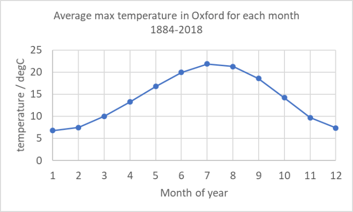
I’m therefore going to do my own manipulation of this data. The first thing I did was to determine an “average January”, “average February” and so on. These involved averaging all the Januaries, all the Februaries etc for the whole timescale. (In Excel I did this using =SUMIF($B$8:$B$2003,N8,$C$8:$C$2003)/COUNTIF($B$8:$B$2003,N8) – which sums and counts all max temperatures (C column) if the B column (month) is equation to “N8” which was 1 for January (N9 was 2 for February etc) and calculates an average. I’m putting this in to help you do the calculation for your choice of weather station! It is good scientific practice to make my work “reproducible” and to show you exactly how I got what I got.).

Having done this, I calculated for every value in the record the difference between the actual value for that month and this “typical” value for the whole record. (In Excel I used: =K8-VLOOKUP(B8,$N$8:$O$19,2) where “K8” was the actual value and the “vertical look up” picked the right month from my table of monthly averages.)
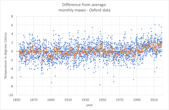
The results are the blue dots in the graph below. You can see that the blue dots are still very noisy, but now the temperature range is about plus and minus 4 degrees Celsius, whereas in the earlier picture it was from 5 degrees Celsius to 25 degrees Celsius.

If you look at the blue dots you do begin to see a trend from 1990 onwards – the number of blue dots below the line (average max temperature in that month was colder than the average for the entire data set) are much fewer. But to see a trend I have to do yet more averaging. The orange line is a rolling average of 12 months (that means that for every point I have averaged it with the 6 points before and the 6 points after). In the orange line you can see an upward trend since 1990.
What I hope I’ve shown here is that even for a simple measurand like “maximum temperature in a day averaged over a month” there is a lot of work to do to interpret the data to see climate trends. What I haven’t shown is the other interpretations that are needed. The MetOffice has changed the way it does these measurements since 1884, probably several times. And some work is needed to ensure that the new data are consistent (interoperable) with the older data.
Note that on their historical data website, the MetOffice says for this data:
No allowances have been made for small site changes and developments in instrumentation.
I hope I’ve also shown that the data are available and that you can handle them yourself in order to interpret them. You can, with enough detective work, go all the way back to the rawest data and understand all the ways the data has been processed and interpreted to get to simple messages – like the #ShowYourStripes diagram at the top of this page.
Interestingly, #ShowYourStripes has also done Oxford separately from the whole UK. I’m not completely sure why I chose it (I did want to avoid major cities and I wanted a place where the record quality was likely to be very good), but they made the same choice. Here are the Oxford stripes. I think these correspond to my orange line (actually theirs are likely to be the average of the blue dots in my graph above for each year, which is slightly different from my rolling-average orange line: it’s probably the value of my orange line for each July).

One thought on “Lesson 12: Measurements of temperature”