But what do we do about it?

I’ve done a lot of travelling recently – mostly by train, but also one flight, which I feel guilty about (but I’ll get onto that later). And on these journeys I have on several occasions talked to the person sitting next to me. At some point in the conversation, they ask me what I do. And when I say I observe climate change, they light up and we have a deep conversation. Several of these serendipitous conversations have been with grandmothers, worried about the world their grandchildren are growing into. Our conversations go well beyond the science – although they want to know about the science too – and fundamentally they come down to ‘what can I really do?’

These conversations have been clarifying my own thinking about what society needs to change. This is not a subject I have any expertise on, so here I write in a personal, rather than professional, capacity. But it is a subject I think a lot about. Of course, there are many other resources on the practical options, and I’ll try to link to them later (although I’m too tired to search them all now). What I want to discuss here is a more general perspective.

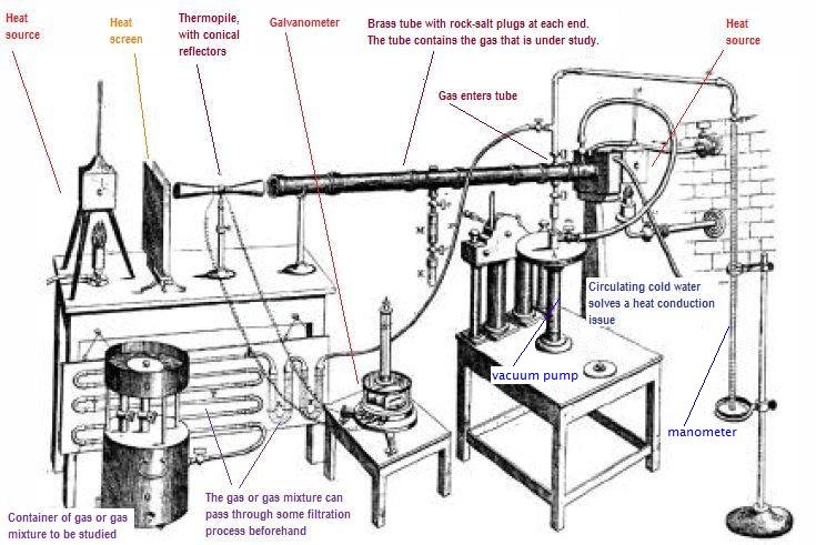
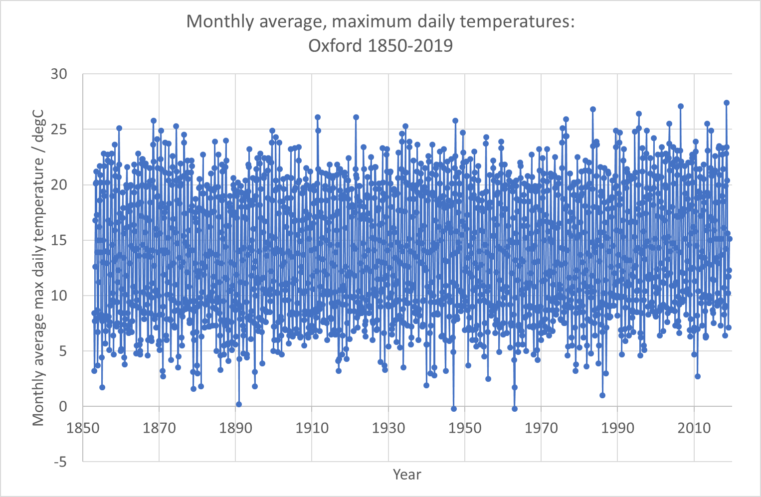
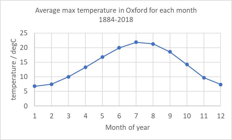
Climate change is real, and more serious than most people realise. Even if you consider yourself well-informed, you are probably underestimating the speed and scale of the changes that are coming (unless you’re panicking, or feeling like it’s too late and we’re all doomed, in which case you may have a different distortion). I have recently been to a large number of climate conferences – and I have found myself in tears during scientific presentations, especially one on melting glaciers in the Alps. The scientist presenting showed pictures of their measuring station in the Alps – and how their institute had been monitoring the glacier in the same spot for 150 years. This summer, the glacier broke off and their station disappeared forever. Something in the way that was presented, in the visual images, made me cry. But the other presentations were telling a similar story – rapid heating of the oceans, sea level rise displacing millions of people, ocean acidification, polar ice caps vanishing, ocean circulation patterns changing, rapid increase in the ferocity and frequency of storms, drought, heatwaves, and so on. We also have less time than we think. Governments are talking about 2050, but what we do in the next 5 years will have massive, long-term impacts – at the world’s current fossil fuel burning rate, we’ll reach 1.5 degC warming in 4-8 years. We need to stop using fossil fuels, now.

But this is terrifying, and most of us feel helpless. I feel helpless, too. But terror is not a good emotion for action – terror leads to our flight or fright response – we either ignore the danger, or we get angry. I fear that when scientists like me keep talking about the problem, and activists keep doing their stunts to force us all to take notice, we’re all reacting with a flight or fright response. (I do, however, understand why activists are doing their stunts and I am going to keep talking about the problem).

There are things we must do as individuals, things we do as communities and things we do as a society and through our governments. Each of us has a different set of background challenges, and a different set of skills and abilities – so we each have different responsibilities. How do we work out what our personal responsibilities are? I know some people who will take a perfectionist attitude. It is true that if we fairly share the remaining ‘carbon budget’ to get to 1.5 degC between the population of the Earth, then we cannot eat meat, chocolate, coffee or dairy products (produced as they are now) more than once or twice a month. We cannot fly, ever. We cannot own a car per family – we should be sharing our (electric or hydrogen, small) cars with our neighbours. We have to buy less stuff (electronics, clothes, …) , especially stuff with short lifespans. (I haven’t double checked all this, so treat details with caution – my point here is the principle, not the detail). Ideally we’d be generating our own electricity with our roof solar panels and capturing rainwater for flushing our toilets or growing our vegetables.

Those kinds of changes are hard. Sometimes impossible. I’m sure each reader (I think I get readers) will have read that previous paragraph with a combination of guilt, fear and perhaps anger (because you can’t do that) and pride (for the ones you are doing better than others). A perfectionist mindset hits other ‘ist’s. It is ableist (harder to do without a car if you are disabled), racist (harder to do without flights if you have family on another continent), classist (harder to make changes if you’re poor and if we stop buying things jobs are lost), pits city vs countryside (our country has a huge public transport issue outside a small number of big cities). And yet, it is needed. We’ve actually missed our chance to do this slowly and gently over a few decades – because of active, intentional misinformation campaigns in the last decade of the 20th century and the first decade of the 21st. Does that make you feel angry? It does me.

So, what can we do? The first thing I think we must recognise is that most change has to come from our governments and the decisions they make. The main problems are from the way society is structured – the choice of building materials, the way steel and concrete are manufactured, the way fossil fuels and sustainable energy, and different farming methods are taxed and/or subsidised, the accessibility of public transport, and availability of alternative options to cars and flying. We as individuals are not without influence (we can influence through our votes, our participation in democracy and/or activism, our influence in our jobs and even our choice of jobs, where our pensions are invested, …), but we need action at state levels.

Our individual actions are also important. Not so much because we actually as individuals have any significant impact on the planet, but because we as individuals can have a lot of impact on other people. We must look out for environmental tipping points because of the risks they pose to us, but we must also look out for social tipping points, because of the opportunities they provide. We’re social creatures and we all want to be doing what everyone around us is doing (think about covid mask wearing norms in different countries, and/or sectors within countries and how they tipped from (almost) ‘no-one’ to (almost) ‘everyone’ and back to (almost) ‘no-one’ as we followed laws and, more importantly, followed those around us. In my childhood bicycle helmet wearing was rare, now it’s very common here). When we change our behaviour, we influence those around us.

I think the hope society has, is in a non-linear growth of pro-environmental behaviour and choices. And in later blogs I want to explore that further. I’m also wondering about setting up some discussion forums – online and in person somewhere near Kingston/Teddington – next year to allow people to talk and ask questions. (If I have the energy, I’m going to discuss the importance of not burning out as individuals next).

This I know experimentally

I’ve not posted here for a while. The pandemic time was quite difficult to balance all my commitments, and this is one of the things that I dropped.

Recently, though, I’ve been giving some presentations / podcast recordings to some different audiences and I wanted to share links to those here. They were given to different audiences and both were very different from my formal professional presentations, and included more personal elements.

The first one was a podcast I did with Rebecca Robertson. Rebecca is a personal financial adviser who also runs money-management courses. She was doing a series of podcasts about ethical investment and sustainable consumerism, and as part of that series, I spoke to her about my work and about some of my own personal choices. You can hear our conversation here:

The second was a presentation that I gave at Kingston Quaker Centre called “This I know experimentally”. The title was chosen to have a double meaning, and I discuss what I know about the planet as an experimental scientist and I am quoting from George Fox, often considered the founder of Quakerism. He used the phrase to describe what he “knew experientially” – that when he sat still and waited for God, he met God in that silence, unmediated and directly.

The live event was not recorded, but I redid the presentation at home without an audience. It’s not quite the same presentation – without audience feedback, the presentation is never as good. And it misses the really valuable conversation we had afterwards, but I hope it’s still of interest!

Climate History: Fourier, Tyndall, Arrhenius and Callendar

Image of Svante Arrhenius, from Wikipedia.

I still have some science to cover – but I’d like to take an aside and write something about the history of our understanding of the climate science.

Joseph Fourier, in 1820, was the first person to realise what the very simple calculation that I described in Climate Lesson 4 that calculates that the temperature of the Earth “should be” much colder than it is. Blackbody radiation would not be fully understood for another 80 years, so his calculation was based on somewhat different premises, and you can read those for yourself (in old-fashioned French) in his paper. He recognised that somehow the incoming radiation must make it through the atmosphere easily, but that the outgoing radiation from the Earth would be blocked in some way by the atmosphere.

Tyndall’s experimental equipment from Wikipedia

In the 1850s, John Tyndall was able to measure the amount of heat absorbed by different atmospheric gases and he concluded that the “Greenhouse effect” that Joseph Fourier had surmised was dominated by water vapour absorption and that carbon dioxide had a smaller, but observable heating effect too.

Svante Arrhenius, in 1896, published a significant paper “On the influence of Carbonic Acid in the Air upon the Temperature of the Ground” (available in full here – this one is in English). In this he calculated that doubling the amount of carbon dioxide in the atmosphere would lead to a temperature rise of around 4 ºC.  I’m amused by how he starts his discussion section with “I should not have undertaken these tedious calculations if extraordinary interest had not been connected with them…” The extraordinary interest was to understand the causes and effects of natural climate variations during and between ice ages, but he already realised:

“The following calculation is also very instructive for the appreciation of the relation between the quantity of carbonic acid in the air and quantities that are transformed. The world’s present production of coal reaches in round numbers 500 millions of tons per annum … Transformed into carbonic acid, this quantity would correspond to about a thousandth part of carbonic acid in the atmosphere …

In a later book he would go on to say that burning coal would have a positive effect on the planet as it would stop the next ice age and would allow more crops to grow (I assume as he was living in Sweden, that he could only imagine warming in a positive way). He did, however, think it would take a 1000 years for humanity to double the carbon dioxide in the atmosphere – he assumed a linear, rather than exponential, increase in our burning of coal (we are on track to have doubled it in 150 years).

[The IPCC AR5 report (see page 82 in the Technical Summary) in 2013 stated that the “Equilibrium Climate Sensitivity” (impact of a step doubling of CO2 in the atmosphere and the planet going into equilibrium thereafter) is “likely between 1.5 ºC to 4.5 ºC”.]

But Arrhenius’s paper was met by a strong criticism by Knut Ångström. Ångström, and his assistant “Herr J Koch”, were doing absorption experiments with carbon dioxide and realised two things that seemed to suggest problems in Arrhenius’s work. First, they changed the amount of carbon dioxide in glass tubes and measured how much infrared radiation was absorbed. Their measurements suggested that carbon dioxide absorption saturated very quickly, meaning that very quickly all the infrared was absorbed and increasing the amount of carbon dioxide made no difference beyond this point.

Even more convincingly, they also showed that water vapour had absorption bands that overlapped the carbon dioxide bands – meaning that those wavelengths were already completely absorbed by water vapour.

This time – around the turn of the 20th Century – was a time when there was a real “greenhouse gas debate”. These two excellent scientists were arguing about confusing evidence and an incomplete and necessarily highly simplified conceptual model of the Earth system.

The assistant Koch’s observations actually didn’t show that there was no difference in absorption as the carbon dioxide was increased – he saw a 0.4 % decrease, which Ångström dismissed as trivial. (Modern calculations suggest he should have seen a 1 % decrease, and this suggests that Koch and Ångström underestimated their uncertainties). 

Arrhenius published a long response (this time in German) to explain why Ångström was wrong – he apparently (I haven’t been able to access the full text) correctly realises that Ångström was oversimplifying his analysis – the spectral bands of water vapour and carbon dioxide do not fully overlap (we also now know carbon dioxide absorption is not fully saturated), but most importantly, the atmosphere is not like a single thin sheet of glass – it has layers, and while the lower layers may mostly absorb the infrared, the outer layers are drier (less water vapour) and the atmosphere itself emits thermal infrared radiation.

Other scientists seem not to have noticed, or understood, Arrhenius’s 1901 paper, and the assumption that Ångström had proven Arrhenius wrong limited research in this area for many decades. Furthermore, there was growing recognition that the Earth itself could, and would, regulate any increase in carbon dioxide by absorbing it mostly in the ocean, and, with any that the oceans didn’t absorb, in increased growth of trees, peat bogs and so forth. The Earth would sort itself out, there wasn’t that much coal anyway and we weren’t (then) burning it fast enough for there to be a problem. (We now know that there are limits to that absorption too – I’ll come back to that).

It was Guy Stewart Callendar who, in the 1940s and 1950s, revitalised the Arrhenius ideas. He, as a hobby, started compiling temperature measurements since the 19th century and started to see an upward temperature trend (we now know that trend was not based on the relatively low increase in carbon dioxide, but on natural effects). To understand this he re-investigated the absorption of carbon dioxide and newer observations that provided more detailed spectroscopy of carbon dioxide absorption; he started to make a coherent model of the atmospheric effect. His papers influenced scientists to start systematic measurements of carbon dioxide in the atmosphere (although he also got a lot of criticism). Charles Keeling started taking Mauna Loa observatory measurements in 1958 as a response (see my earlier blog on that).

Now my opinion on all this: I’ve been reading climate sceptic blogs and webpages and many of them gleefully say that “the first climate alarmist Arrhenius, who was an amateur scientist, was proven wrong by the much better scientist Ångström…” In this they are misunderstanding the whole scientific method (and confusing Ångström with his father). Both Arrhenius and Ångström were good scientists who were working on limited information, poor models and experiments that were in their very early days. Both made mistakes of understanding – but both also showed new concepts that were essential pieces of the jigsaw that more recent scientists have put together. Most importantly – this argument is over – we now understand what neither of those scientists understood, we have better observations of everything from the absorption spectra of carbon dioxide and water (using similar  experiments to those of Ångström and Koch, but with more sophisticated analyses) to the atmospheric composition and we have models that split the atmosphere into far finer levels than Arrhenius imagined, and which also include clouds and atmospheric circulation (that he couldn’t include).

Oh, and as a personal note, when I was at Imperial College in the mid 1990s, I won both the Tyndall and the Callendar prizes. It’s nice to be building on their work!

Lesson 12: Measurements of temperature

EUROPE-United_Kingdom--1884-2018-MO
UK temperature stripes from #ShowYourStripes (https://showyourstripes.info/). This shows all the years from 1884 (left) to 2018 (right). The coldest average year is dark blue, the hottest average year is dark red and the other years are coloured between these.

#ShowYourStripes is a visualisation tool for showing the changing average temperature over the last ~150 years. You can go to their website and find “your” stripes – for your country or another one. Have a look at several countries. I found it interesting to compare New Zealand to Syria and the Central African Republic. I haven’t found a country yet that isn’t more red on the right and more blue on the left.

But, what does “average temperature” mean? Fortunately, almost all the data we have collected is made publicly available, for free. This means that we can all do our own research and understand what’s happening. Granted, some free data requires expert analysis, but “temperature” is a concept we can all understand (and many of us can measure ourselves in our own garden).

On the UK MetOffice website, you can access historical temperature records for anywhere in the country. I downloaded the data for Oxford and imported them into Microsoft Excel. The data look like this.

Oxford raw data
Screenshot of the Oxford data after they have been copied into Excel

The first column is year, the second is month. What you then have are the average maximum temperature for all days in that month and the average minimum temperature for all nights in that month. It also gives the number of days with air frost, the total rainfall over the month in mm and the total hours of sunshine that month (from 1929 onwards).

The first thing I did was plot the data (this was almost as simple as it sounds – the only step I did was to create a year-month as a decimal year using the simple formula =YEAR+(MONTH-1)/12. When I had done that it looked like this:

Plot1Oxford data
My raw plot of the Oxford data using Excel’s basic plotting function

Now, this plot shows us the first problem with observing any climate record – seasonal variations are always far larger than the climate trend you are looking for. And this is based on the monthly average of the maximum temperature. If we plotted daily maxima or hourly values it would be even more all over the place! This is why all observational data is “manipulated”. It’s impossible to see what you’re looking for in raw data – raw data variations are dominated by the diurnal cycle (night and day) and by seasonal cycles and by noisy weather. There are also longer-term effects (like the El Niño) that affect a few years.

I’m therefore going to do my own manipulation of this data. The first thing I did was to determine an “average January”, “average February” and so on. These involved averaging all the Januaries, all the Februaries etc for the whole timescale. (In Excel I did this using =SUMIF($B$8:$B$2003,N8,$C$8:$C$2003)/COUNTIF($B$8:$B$2003,N8) – which sums and counts all max temperatures (C column) if the B column (month) is equation to “N8” which was 1 for January (N9 was 2 for February etc) and calculates an average. I’m putting this in to help you do the calculation for your choice of weather station! It is good scientific practice to make my work “reproducible” and to show you exactly how I got what I got.).

Oxford plot 2
My calculation of the average of the monthly average max temperatures for each month over the whole time range.

Having done this, I calculated for every value in the record the difference between the actual value for that month and this “typical” value for the whole record. (In Excel I used: =K8-VLOOKUP(B8,$N$8:$O$19,2) where “K8” was the actual value and the “vertical look up” picked the right month from my table of monthly averages.)

The results are the blue dots in the graph below. You can see that the blue dots are still very noisy, but now the temperature range is about plus and minus 4 degrees Celsius, whereas in the earlier picture it was from 5 degrees Celsius to 25 degrees Celsius.

Oxford plot 3
Difference between actual data and average for each month (blue dots) and a 12-month rolling average of that (orange line)

If you look at the blue dots you do begin to see a trend from 1990 onwards – the number of blue dots below the line (average max temperature in that month was colder than the average for the entire data set) are much fewer. But to see a trend I have to do yet more averaging. The orange line is a rolling average of 12 months (that means that for every point I have averaged it with the 6 points before and the 6 points after). In the orange line you can see an upward trend since 1990.

What I hope I’ve shown here is that even for a simple measurand like “maximum temperature in a day averaged over a month” there is a lot of work to do to interpret the data to see climate trends. What I haven’t shown is the other interpretations that are needed. The MetOffice has changed the way it does these measurements since 1884, probably several times. And some work is needed to ensure that the new data are consistent (interoperable) with the older data.

Note that on their historical data website, the MetOffice says for this data:

No allowances have been made for small site changes and developments in instrumentation.

I hope I’ve also shown that the data are available and that you can handle them yourself in order to interpret them. You can, with enough detective work, go all the way back to the rawest data and understand all the ways the data has been processed and interpreted to get to simple messages – like the #ShowYourStripes diagram at the top of this page.

Interestingly, #ShowYourStripes has also done Oxford separately from the whole UK. I’m not completely sure why I chose it (I did want to avoid major cities and I wanted a place where the record quality was likely to be very good), but they made the same choice. Here are the Oxford stripes. I think these correspond to my orange line (actually theirs are likely to be the average of the blue dots in my graph above for each year, which is slightly different from my rolling-average orange line: it’s probably the value of my orange line for each July).

EUROPE-United_Kingdom-Oxford-1814-2018-MO
Oxford temperature stripes from #ShowYourStripes. Try to compare with my orange line


Lesson 11b: How do we know it’s fossil fuel burning?

As I was writing about carbon dioxide levels rising in the previous post, I began asking myself what evidence we have to support that the rise is caused by fossil fuel burning by us – rather than from natural causes. That set me off down different paths – which I’ll explore with you here. I’m not an expert on any of these topics, but I know how to think about things in a scientific way – so here are my explorations.

radiocarbon_sub1
Principles of carbon dating. Image from http://rses.anu.edu.au/services/anu-radiocarbon-laboratory/radiocarbon-dating-background

First, I wondered about whether the carbon dating techniques would teach us about this. Carbon dating is a technique used to work out how old wooden objects are. It works like this: In the upper atmosphere, nitrogen atoms are hit by cosmic rays and are converted into carbon-14 (carbon atoms with 6 protons and 8 neutrons). Carbon-14 is radioactive and it decays, slowly, back to nitrogen (7 protons, 7 neutrons). If you have a large number of carbon-14 atoms, then after ~5730 years, half of them have decayed back to nitrogen (that’s what a half-life means). In the atmosphere, the cosmic rays keep making new carbon-14 atoms. A growing tree will take in carbon-14 as well as the other isotopes of carbon (carbon-12 and carbon-13) from the atmosphere while it is alive. Once it dies, there is no more carbon-14 coming in from the atmosphere but the carbon-14 that is in the wood continues to decay into nitrogen. So, if a boat or a chair was made from a tree, you can tell how old it is by seeing how much carbon-14 is left in it. Every ~5730 years the amount of carbon-14 halves.

Now, fossil fuels are fuels made from fossilised wood that grew hundreds of millions of years ago. So, there have been many, many half-lives that have passed, and there is no carbon-14 left. I wondered whether, as a result of us burning fossil fuels, the amount of carbon-14 in the air is noticeably lower than it “should be”?

I read quite a few online documents and scientific papers and discovered a couple of things – first that in the early 20th century there was a noticeable “ageing” of the atmosphere – it looked older than it should have done. But then we really messed up the readings by setting off lots and lots of atomic bombs.

Hemispheric_14C_graphs_1950s_to_2010
Image from Wikipedia article. I’m not sure what the vertical axis really means because carbon-14 is never several percent of the carbon, but while I think they’ve missed off a scaling factor, or not explained what it is a percentage of, the shape tells a powerful story – atmospheric carbon-14 went up when we released nuclear bombs

However, that’s now dropping and the scientific paper I found suggests that by 2050 brand new wood might look like it grew in 1050! I’m not completely sure whether that’s based on measurement or projection making the assumption that humans are emitting fossil carbon, but it does provide some evidence that you could test.

There’s also another carbon isotope, carbon-13. This is not radioactive, so doesn’t decay. From that you can tell something about the origin of the material. Photosynthesis affects the ratio of carbon-13 to carbon-12 as it prefers one to the other (I’m massively out of my depth with this chemistry and biology, so I’ll stop there – but apparently there are two types of photosynthesis). Whereas geological processes have no such bias. Therefore, if something was ever a plant, or ate a plant, the ratio is different than if it came from rocks. As a result you can distinguish fossil fuel carbon (from 100s of millions of years old trees that had photosynthesis) from volcano carbon. And the increase in carbon dioxide in the atmosphere shows it comes from plants – but ones that are old enough for carbon-14 to decay: in other words, fossil fuels.

We attempt to track carbon dioxide from volcanoes. There is no where near enough. Even if we’re a lot wrong in that, it’s not enough.

Also the oxygen levels are decreasing at the rate you’d expect if we were burning things. And we know carbon dioxide levels are increasing in the ocean, so it’s not ocean outgassing.

Other evidence that the increase in carbon dioxide comes from us comes from a simpler source – we know how much fossil fuel we’ve dug or pumped out of the ground. Because it has a monetary value, we actually track that very carefully. Basic chemistry tells us that carbon dioxide is a combustion product when we burn fossil fuels (we can also measure that in a laboratory easily). So we can calculate how much increase we’d expect.  The increase in carbon dioxide in the atmosphere is quite a lot lower than what we’d expect from that simple calculation. That’s because the oceans and the trees have taken up a lot of our emissions. But not all. And measurements over them (e.g. by those satellites we talked about in the last lesson) show that they are now absorbing less (the oceans are “saturating” and simply can’t take any more and we’re cutting down, rather than planting, forests). The global climate budget tries to track and measure all this.

(I promise a later blog called “But dinosaurs didn’t drive SUVs” to discuss why carbon dioxide levels were much higher in their days without us).


Lesson 11: Carbon dioxide measurements from Mauna Loa

co2_data_mlo
Obtained from https://www.esrl.noaa.gov/gmd/ccgg/trends/full.html. This shows the atmospheric carbon dioxide measurements from the Mauna Loa Observatory

Today I’d like to talk a bit about the observations of climate change. Observations are used both to set up climate models and to test them. That is a bit circular – and where independent data sets exist, different data sets are used for these two roles – but usually the observations are used to tune the model using a method called “data assimilation” which is a mathematical process that tries to minimise the average difference between prediction and observation.

There are three types of observation we need to consider: observations of the quantities that affect the climate, observations of the changing climate and observations of the effects of changing climate. In practice, these three categories are blurred (many observations are both cause and effect).

Today we’ll consider the first of these, and in particular the graph that was published widely in the last week because it measured the highest carbon dioxide levels yet: the Mauna Loa observation of carbon dioxide levels in the atmosphere. As we considered in lesson 7, carbon dioxide is a powerful greenhouse gas that affects the Earth’s radiative energy balance (though not in a simple manner). The Mauna Loa Observatory is on a volcano in Hawaii – right in the middle of the Pacific, and, most significantly, a very, very long way from any meaningful industry. The instruments are at the top of the mountain – 3397 m above sea level – again conditions that keep the observations pure. The observatory has measured carbon dioxide daily since March 1958 by taking samples of air and analysing which gases are inside them.

There is an excellent video at https://youtu.be/gH6fQh9eAQE, which I will embed here:

In the video you can see the observations of carbon dioxide from observatories since 1989. The red dot is Mauna Loa (the black dots are other stations around the world – over time the number of black dots changes as stations come in and out of operation). The upward trend is clear – and this has to be factored into the climate models. The zig-zag pattern is due to the seasons – and in particular due to the summer leaf growth in the northern hemisphere which temporarily removes carbon dioxide from the atmosphere. But the unceasing upward trend behind this is because we’re burning fossil fuels (and, to a more minor extent, because we’re cutting down forests and there are more forest fires).

One problem with these observations is that they are made at only a few sites and these sites are intentionally chosen to be well away from the places where fossil fuels are burnt. There are some satellites that are now measuring global CO2 levels – and these can show where the CO2 is. These work by observing the absorption of the spectrum (seeing how black the black lines are) of sunlight reflected by the Earth in wavelengths we know carbon dioxide absorbs (see back to earlier lessons). In particular they make measurements in a “weak-CO<sub>2<\sub>” band, a “strong-CO<sub>2<\sub>” band and an oxygen O<sub>2<\sub> band. The strong band is a band where carbon dioxide strongly absorbs: this band gives information about the overall absorption of carbon dioxide. The weak band is one where carbon dioxide only partly absorbs. This means it goes through most of the atmosphere undisturbed and gives information about carbon dioxide absorption near the surface: in other words it gives information about whether the surface is a source (e.g. factory) or sink (e.g. forest) of carbon dioxide and to what extent. The oxygen band is a reference band to compare the carbon dioxide against.

The main current CO2 sensor is the NASA OCO-2 satellite which has run since 2014 (OCO failed on launch in 2009).

You can get a video of OCO-2’s observations on YouTube too (https://youtu.be/x1SgmFa0r04)

There’s a joint French-British satellite mission called Microcarb that is currently being built to be launched in 2021 that will also perform satellite-based carbon dioxide measurements.

Aside on climate politics and tobacco

This blog is my opinion.

I am intentionally separating the science of climate change from a discussion of the politics and what we should do about it. Too often, people have conflated the two. I think Al Gore talking about climate change was one of the most damaging decisions ever (and he should never have got a Nobel Prize). Because, and particularly in the USA, people who disagreed with his suggested solutions to the problem, chose to argue with the science, rather than the politics. I think they didn’t understand the difference between different types of “truth”. (I wrote a lot about different types of truth in 2016 and the 2nd-5th posts on this blog are about that). I believe politicians and all of us should be grappling with (and that includes arguing about) what we are going to be doing about climate change. We should not be arguing about whether anthropogenic climate change is real or not.

I am trying to give a faithful and honest account of what I understand about climate change in my lessons. The science is not perfectly known and there are some very big unknowns – for example how positive cloud feedback is – but just because we don’t know everything doesn’t mean we know nothing. The science of climate change will advance and with that advance it will become ever more possible to understand the detail of what’s happening, but we already know the main point: anthropogenic climate change is putting human civilisation as we know it at risk. We either have to stop it (mitigation) or we have to adapt to it. Or perhaps a bit of both.

But we’ve only fully understood this for about 20 years. We’ve had hints before that, and the hints have got stronger and clearer over time, but the clear picture we have now is very recent. I think there are parallels with how we learnt about – and then reacted to – the dangers in tobacco which it’s useful to draw.

The first scientific study on the dangers of tobacco was in 1791. John Hill did a clinical study that showed that snuff users were more likely to get nose cancer. A debate about tobacco in the Lancet started in 1856. In 1889 Langley and Dickenson do the scientific studies that start to explain why nicotine is dangerous. They start modelling the processes by which nicotine effects the cells in our bodies. In 1912 the connection between smoking and lung cancer is first published. The first large-scale scientific analysis of that connection was in 1951. In 1954 the Readers Digest published an article about this and that article contributed to the largest drop in cigarette sales since the depression. In 1962 the British Royal College of Physicians published a report saying that the link was real and in 1964 the US Surgeon General did the same. Cigarette adverts were banned on tv in 1965. Cigarette smoking was banned on the London underground in 1984 – but not for health reasons, instead because a dropped cigarette may have contributed to a fire at Oxford Circus. A comprehensive review about the dangers of passive smoking came out in 1992. Over time more and more things are banned – no smoking zones are introduced in pubs, advertising has bigger warnings …. and eventually in 2003 tobacco advertising is banned in the UK and in 2007 smoking in workplaces is banned in England. Now, 12 years on, I think most of us consider this normal. [I got these dates from an interesting document online: http://ash.org.uk/information-and-resources/briefings/key-dates-in-the-history-of-anti-tobacco-campaigning/]

In 1964 the evidence was clear. We didn’t understand everything – we didn’t understand all the effects of passive smoking, we weren’t quite sure about how a mother smoking affected the fetus in her womb, we didn’t know the link between smoking and cervical cancer or heart disease… but we knew it was dangerous and we took our first steps towards changing it. We had to change people’s attitudes, we had to get people to change how they did things, we had to make smokers uncomfortable on long-haul flights. And people sued the tobacco firms and they fought back – and often won – court cases. It was a long journey that often didn’t go what we now, in hindsight, see as the right way.

I think in climate change we reached that 1964 moment with the publication of the first IPCC report in 1990. There was a lot that that report didn’t know – just like the 1964 tobacco and health reports didn’t know everything either. But equally, it was the first clear report that the problem was real.

If it follows a similar timescale, and I think human nature is such that that’s a good first approximation, that would put climate change in 2020 in the same place as tobacco smoking in 1994. That’s the year some individual organisations made voluntary changes – like Wetherspoons introducing smoke free areas in their pubs, and Cathay Pacific introducing smoke free long-haul flights. It’s also the year that the tobacco companies lost their court battle to stop the warnings being printed in big font on their cigarette packets. There were signs that the numbers of smokers were dropping and British Rail had banned smoking a year earlier – to 85% approval. But there were still 8 years to go before smoking was banned in workplaces – and it probably would have felt too much back then. (I remember being pleased to have a smoke free area in the pub and I didn’t question that the rest of the pub still allowed smoking, I just held my breath walking from the bar to the place I was sitting).

I think that if we’re doing the voluntary stuff now, and the legal stuff catches up with us in 5-10 years – we’ll probably end up ok. But we all need to be talking about this and saying that we want to live in a world where burning fossil fuels seems as old fashioned, unhealthy and odd as smoking in British pubs does today.


Lesson 10: Anthropogenic Climate Change

models-observed-human-natural
Figure from the report  “Climate Change Impacts in the United States: the Third National Climate Assessment” (2014). https://nca2014.globalchange.gov/

In the last few lessons I’ve been talking about climate models and how they can model incredible complexity including energy balance, convection (circulation) in the atmosphere and oceans, and biogeochemical processes. Once we have such models we can do many things. First, the models help us ask questions and test our assumptions. They allow us to explore “what if” scenarios and understand how important certain components of the system are. Second, the models help us to predict the future and third, they allow us to understand what we can, and cannot, influence.

The figure above comes from a US government report published in 2014. It compares two runs of a climate model with observations of “global average temperature”.

The two model runs have a broad shaded area. That represents the uncertainty of the model – it indicates the range that the temperature could be in, based on multiple runs of the model (the so-called “ensemble run”) in which initial starting points (and the sizes of certain effects) are varied from run-to-run in a way that is consistent with our understanding of our lack of knowledge.

Global average temperature is not an easy thing to measure (we’ll come on to that in later lessons), but the black line is the result of our best attempt at combining the data we have. Really it should also have “uncertainty” prescribed to it – I’d prefer to see this graph with a band around the black line too. I don’t know enough about how this value is determined (I’ll try to find out and get back to you!), but my guess is that it has an uncertainty (width) of somewhere between half that of the models and the same size as the models.

The green model band describes “natural factors only”. This runs the model considering all the biogeophysical processes, and also considering the distance between the Earth and the Sun, variations in the solar cycle, volcanos erupting and releasing gases into the atmosphere, trees growing and dying, lightning-caused fires and so on. The blue model band describes “natural and human factors”. It includes all the quantities above, but also includes anthropogenic (human released) fossil fuel burning (coal, oil, gas), cement making, the release of particles in cities (smog, air pollution), refrigerant gases (CFCs and their more modern replacements), methane release in industrial-style farming and landfill waste tips), and land use changes (cities, deforestation). Note that 80% of the observed difference between the blue and green lines is due to fossil fuel burning. The other things make up a further 20% of that.

Until 1980 you can’t tell the difference between the lines. It becomes clear (now, in hindsight) around 1990. But it’s worth remembering that in 1990 our computers were a lot smaller, our climate models a lot less detailed (remember the 1987 storm that the MetOffice failed to predict – that was because the weather forecasts were a lot less reliable then – and the climate models are based on the same programs as the weather models). So while in hindsight it was around 1990 that humans became a driving force in the climate, we’ve only had the science to understand that since about 2010. We are in the very early days of our full understanding of the problem.

I’d like to keep the science and the politics separate, so I’ll write a separate note on my thoughts about this.


Lesson 9b: Seeing the wood for the trees

In Lesson 9 I make a common mistake of describing scientific progress in terms of increasing complexity. I explained about “early” climate models that were energy balance models, “later” climate models that included the circulation/convection of the atmosphere and ocean and “modern” climate models that include all these things and also chemistry and biology.

Since I wrote that I’ve been realising that this, while a nice “story”, is not really true. Because I am writing these blog posts and then scheduling them for publication a few days later, I realised I could edit the previous lesson before it was published, or write this follow on post. I went for the latter option, because I think the “nice story” is easier to follow. I guess in that way it’s like the model itself – the nice story of a progression of complexity is a simple model of the history of climate modelling and one that is very helpful to explain why models have got better over time. The nice story models some “big picture” stuff, but gets a lot of details wrong. A fuller story will describe the detail more accurately, but will be messier and we’ll lose information. We’ll be “unable to see the wood for the trees” – metaphorically in the case of how I tell the history.

Being literally “unable to see the wood for the trees” is one of the reasons why we still use simple climate models today. A thorough modelling of all the details can sometimes lose something. Earlier in my career I came across the concept of the “missing sunlight” – what this was telling us was that the detailed modelling of where incoming sunlight went (some reflected from clouds, some from the surface, UV parts absorbed by the ozone layer, some lines absorbed by atmospheric gases, some absorbed by the surface to heat up the Earth …) didn’t add up to what the big picture model of “energy in = energy out” was saying. In our forest, the treatment of individual trees misses some of the interactions between trees. There’s a similar “missing water” problem in the Amazon rainforest where the total rainfall seemed twice as big as the outflow of water from the Amazon river system. Later it was realised that water wasn’t just evaporating from the rivers and oceans, it was also evaporating from leaves and being released by trees – and that water was raining down again: a large proportion of the rain was recycled.

For all these reasons, simpler climate models have a very important part to play in modern climate research. They help us understand the processes and test the complex models, they allow for faster “experimental” tests of different processes. They make sure we continue to see the wood as well as the trees.

Conversely, the first attempt at a fully integrated climate model that considered many different complex interactions and treated the calculations in a three dimensional way, was in the 1950s. Computer power was considerably poorer then, and the models were less sophisticated in some ways, but there was an attempt to model all the interactions together.

Lesson 9: Inside the climate models

Globe_as_a_grid
Representation of a Global Climate Model (note this image is in multiple places on the internet but none seem to have the authenticity of being the original version

In the last lesson we learnt about Lewis Fry Richardson developing the concept of numerical weather forecasting. In the 1910s and 1920s his idea could not be realised because we did not have sufficient computing power. Today, that computing power exists – indeed of the UK’s top 7 supercomputers, four are at the Metoffice and two at ECMWF (the European Centre for Medium-Range Weather Forecasting). The only one that isn’t used for weather and climate forecasting is at the Atomic Weapons Establishment (and I dread to think what they use it for).

The weather and climate models of today work as Lewis Fry Richardson predicted: they break the Earth and its atmosphere up into little boxes and in each box they predict the change in conditions over a certain defined time step. They then pass that information to neighbouring boxes.

Over time, weather and climate models have become more complex in:

  • The range of phenomena that they include in their models (discussed below)
  • The size of the boxes and time steps (smaller boxes, smaller time steps)
  • The variety of observational data that they bring into the models
  • Their handling of uncertainty in the modelling processes and in the observations
  • Their ability to predict both overall trends and detail (so moving from making predictions for averages to predictions for specific areas)
  • The human and geological behaviour that they can include in the models (fossil fuel burning, deforestation, volcanos etc).

The simplest climate models are “energy balance models” (EBMs). These do what we considered in our thought experiment in lesson 4, extending it as we did in 4b. They generally split the world into rings of latitude. In each ring they consider the energy in (from the sun based on the average amount of sunlight to hit that ring over a day and a year) and the energy out (the reflected sunlight, which depends on the average albedo – that is reflectance, and the thermal infrared Earth emission and thermal infrared emissivity – that is how well it emits that wavelength). The greenhouse effect is included as a temperature increment – the amount that those greenhouse gases cause a temperature rise. Such models can give basic information about the Earth system – and explain the basic temperature changes that we see.

The simple models can also consider some feedback processes. Since 1969 climate models have considered the “sea-ice albedo” feedback. This affects these energy balance equations near the poles. When the temperature of the Earth is cooler, there is more sea ice and that reflects sunlight back to space, reducing the amount of sunlight that heats up the Earth and therefore cooling the Earth further (this was an important feedback mechanism during the ice age). When the temperature of the Earth is warmer, the sea ice melts and the dark sea that is there instead absorbs a much larger fraction of the sun’s light, warning up the Earth further.

Energy Balance Models can also study the impact of changes in the output of the sun (the sun has an 11-year sunspot cycle and is about 0.3 % brighter when there are more sunspots than it is when there aren’t any. During 1650 – 1700 there was a period of time with almost no sunspots (the Observatoire de Paris was taking records daily) and that corresponds to the “Little Ice Age” (though at the same time there were increased volcanic activity and probably a significant regrowth of rainforest in central America after European diseases, introduced by the explorers, wiped out a very large population – both of those factor may also have altered the climate).

However, energy balance models must be superficial when used alone. Instead they are one component of more complex models. The next, and essential, level of sophistication is to add in convection. I mentioned in an earlier lesson that a garden greenhouse does not heat up because of “the greenhouse effect” but because the glass stops the air circulating. We also know that “radiators” in our houses don’t really work by radiating heat, but by setting up circulation patterns in the air in the room (hot air rises). Similar processes happen in the oceans. London (51 degrees latitude North) is much warmer than Ottawa (45 degrees latitude North) because of the gulf stream that transports hot water from central America towards Europe.

Circulation models need to consider the Earth not in latitude bands, but in the small boxes (including boxes on top of each other into the atmosphere and down into the sea) and consider the currents in the ocean and the winds in the atmosphere and how that means water or air is passed from one box to the next. Circulation models also include physical processes in the ocean and atmosphere – how water vapour condenses into clouds and how clouds precipitate into rain and snow. It is circulation models that model “cloud feedback” which we discussed before.

The gulf stream is driven by salt in the sea water. As water travels from the Equator towards the poles, some evaporates, and therefore the remaining water becomes more salty. Salty water has a higher density (is heavy) and sinks and this sinking drives the “conveyor belt”. There’s a nice video from the MetOffice on youtube that explains this.

One topic that has been discussed in the media (and was the basis of a film) is a concerning possible future feedback could be that as the Greenland ice sheet melts, the fresh (not salty) water introduced just at the point where the Gulf Stream sinks, could stop the whole circulation – changing the patterns across the world and, potentially, making Europe colder! The latest IPCC report, however, says that this is “very unlikely”, though there may be changes in how the circulation occurs.

Modern models “coupled climate system models” include more processes, including chemical processes (chemistry in the ocean, in the atmosphere and at the boundary between the ocean and the atmosphere) and biological processes (growth of trees and algae and the chemical and biological changes that creates: e.g. photosynthesis, carbon storage in trees and in the soil, the effects of fire). They also model human effects – from the “heat island” effects of cities to the impact of paving our roads and gardens on the water cycle.

Modern climate models are some of the most complex computer programs in the world, written by huge teams of experts, each concentrating on one small detail, and running on some of the world’s most powerful computers. They are the achievement of huge multidisciplinary teams of physicists, chemists, biologists (and most importantly those working at the cross-over between disciplines: biochemists, biophysicists), computer scientists, engineers and mathematicians. There are approximately 30 teams of scientists who have developed climate models that run on different computers running different codes. Those teams go to conferences together and learn from each other, but each team makes its own decisions about which details to include and how to model them. They also make different decisions about which observational data (the subject of a later lesson) to include.

The Earth System is extremely complicated. Our models are our best attempt to simulate the real Earth. As our science has become more sophisticated, and as our computers have become more powerful, we have been able to include more and more detail into those models. But we must never forget that they are models and not reality in and of themselves.