Featured

Climate Lessons Introduction

This is my personal blog. I’ve been using it for a few years to post my thoughts. At first it was a place where I explored my thoughts about topics that were controversial – particularly those that people argued about on Facebook. I also explored my faith and how I connected my science to my faith.

However, recently, I started writing “lessons on climate change” on Facebook. I did so because I wanted to help my friends understand some of the basic principles of climate science. I soon realised Facebook was not the best place for such lessons, so I moved them here. Because the blog still has some more personal posts, I’ve left this anonymous. I may change that later – but I’m guessing most of my readers know exactly who I am.

I’ve now posted quite a few climate blogs – so I’ve created a page to help you find them easily.

But what do we do about it?

I’ve done a lot of travelling recently – mostly by train, but also one flight, which I feel guilty about (but I’ll get onto that later). And on these journeys I have on several occasions talked to the person sitting next to me. At some point in the conversation, they ask me what I do. And when I say I observe climate change, they light up and we have a deep conversation. Several of these serendipitous conversations have been with grandmothers, worried about the world their grandchildren are growing into. Our conversations go well beyond the science – although they want to know about the science too – and fundamentally they come down to ‘what can I really do?’

These conversations have been clarifying my own thinking about what society needs to change. This is not a subject I have any expertise on, so here I write in a personal, rather than professional, capacity. But it is a subject I think a lot about. Of course, there are many other resources on the practical options, and I’ll try to link to them later (although I’m too tired to search them all now). What I want to discuss here is a more general perspective.

Climate change is real, and more serious than most people realise. Even if you consider yourself well-informed, you are probably underestimating the speed and scale of the changes that are coming (unless you’re panicking, or feeling like it’s too late and we’re all doomed, in which case you may have a different distortion). I have recently been to a large number of climate conferences – and I have found myself in tears during scientific presentations, especially one on melting glaciers in the Alps. The scientist presenting showed pictures of their measuring station in the Alps – and how their institute had been monitoring the glacier in the same spot for 150 years. This summer, the glacier broke off and their station disappeared forever. Something in the way that was presented, in the visual images, made me cry. But the other presentations were telling a similar story – rapid heating of the oceans, sea level rise displacing millions of people, ocean acidification, polar ice caps vanishing, ocean circulation patterns changing, rapid increase in the ferocity and frequency of storms, drought, heatwaves, and so on. We also have less time than we think. Governments are talking about 2050, but what we do in the next 5 years will have massive, long-term impacts – at the world’s current fossil fuel burning rate, we’ll reach 1.5 degC warming in 4-8 years. We need to stop using fossil fuels, now.

But this is terrifying, and most of us feel helpless. I feel helpless, too. But terror is not a good emotion for action – terror leads to our flight or fright response – we either ignore the danger, or we get angry. I fear that when scientists like me keep talking about the problem, and activists keep doing their stunts to force us all to take notice, we’re all reacting with a flight or fright response. (I do, however, understand why activists are doing their stunts and I am going to keep talking about the problem).

There are things we must do as individuals, things we do as communities and things we do as a society and through our governments. Each of us has a different set of background challenges, and a different set of skills and abilities – so we each have different responsibilities. How do we work out what our personal responsibilities are? I know some people who will take a perfectionist attitude. It is true that if we fairly share the remaining ‘carbon budget’ to get to 1.5 degC between the population of the Earth, then we cannot eat meat, chocolate, coffee or dairy products (produced as they are now) more than once or twice a month. We cannot fly, ever. We cannot own a car per family – we should be sharing our (electric or hydrogen, small) cars with our neighbours. We have to buy less stuff (electronics, clothes, …) , especially stuff with short lifespans. (I haven’t double checked all this, so treat details with caution – my point here is the principle, not the detail). Ideally we’d be generating our own electricity with our roof solar panels and capturing rainwater for flushing our toilets or growing our vegetables.

Those kinds of changes are hard. Sometimes impossible. I’m sure each reader (I think I get readers) will have read that previous paragraph with a combination of guilt, fear and perhaps anger (because you can’t do that) and pride (for the ones you are doing better than others). A perfectionist mindset hits other ‘ist’s. It is ableist (harder to do without a car if you are disabled), racist (harder to do without flights if you have family on another continent), classist (harder to make changes if you’re poor and if we stop buying things jobs are lost), pits city vs countryside (our country has a huge public transport issue outside a small number of big cities). And yet, it is needed. We’ve actually missed our chance to do this slowly and gently over a few decades – because of active, intentional misinformation campaigns in the last decade of the 20th century and the first decade of the 21st. Does that make you feel angry? It does me.

So, what can we do? The first thing I think we must recognise is that most change has to come from our governments and the decisions they make. The main problems are from the way society is structured – the choice of building materials, the way steel and concrete are manufactured, the way fossil fuels and sustainable energy, and different farming methods are taxed and/or subsidised, the accessibility of public transport, and availability of alternative options to cars and flying. We as individuals are not without influence (we can influence through our votes, our participation in democracy and/or activism, our influence in our jobs and even our choice of jobs, where our pensions are invested, …), but we need action at state levels.

Our individual actions are also important. Not so much because we actually as individuals have any significant impact on the planet, but because we as individuals can have a lot of impact on other people. We must look out for environmental tipping points because of the risks they pose to us, but we must also look out for social tipping points, because of the opportunities they provide. We’re social creatures and we all want to be doing what everyone around us is doing (think about covid mask wearing norms in different countries, and/or sectors within countries and how they tipped from (almost) ‘no-one’ to (almost) ‘everyone’ and back to (almost) ‘no-one’ as we followed laws and, more importantly, followed those around us. In my childhood bicycle helmet wearing was rare, now it’s very common here). When we change our behaviour, we influence those around us.

I think the hope society has, is in a non-linear growth of pro-environmental behaviour and choices. And in later blogs I want to explore that further. I’m also wondering about setting up some discussion forums – online and in person somewhere near Kingston/Teddington – next year to allow people to talk and ask questions. (If I have the energy, I’m going to discuss the importance of not burning out as individuals next).

This I know experimentally

I’ve not posted here for a while. The pandemic time was quite difficult to balance all my commitments, and this is one of the things that I dropped.

Recently, though, I’ve been giving some presentations / podcast recordings to some different audiences and I wanted to share links to those here. They were given to different audiences and both were very different from my formal professional presentations, and included more personal elements.

The first one was a podcast I did with Rebecca Robertson. Rebecca is a personal financial adviser who also runs money-management courses. She was doing a series of podcasts about ethical investment and sustainable consumerism, and as part of that series, I spoke to her about my work and about some of my own personal choices. You can hear our conversation here:

The second was a presentation that I gave at Kingston Quaker Centre called “This I know experimentally”. The title was chosen to have a double meaning, and I discuss what I know about the planet as an experimental scientist and I am quoting from George Fox, often considered the founder of Quakerism. He used the phrase to describe what he “knew experientially” – that when he sat still and waited for God, he met God in that silence, unmediated and directly.

The live event was not recorded, but I redid the presentation at home without an audience. It’s not quite the same presentation – without audience feedback, the presentation is never as good. And it misses the really valuable conversation we had afterwards, but I hope it’s still of interest!

Covid-19, Parenting and Working

Or Changing from Productivity to Fruitfulness
blur close up focus ground
Photo by Gelgas on Pexels.com.
A seedling. It is time to become less “productive” and more “fruitful”

Four weeks ago I was aware I was working too hard – doing more than the 36 hours a week I was paid for, answering “busy” when asked how I was, and realising that I could either attend meetings, or answer emails or do work – but certainly not all three. I was fitting in regular business travel as well – long hours and time away from home. This was not a temporary thing, nor was it desirable. Many friends were worried about me and were, perhaps, unaware that I was actually making big steps towards changing this all – steps that weren’t yet ready to come to the surface but which are now bearing fruits – at just the time they are most needed.

Two weeks ago I was ill. My work didn’t neatly transition – I was simply too ill to come into work one day, nor to work for the next 5 days. I had just got to the point where I could work again, when my sons were sent home from school – indefinitely and full time (with my symptoms they had to self isolate earlier than others, but now the whole country is experiencing this).

In the first few days with my children at home I threw my energy into it – I tried to do 7 hours of work, 4 hours of homeschooling and to cook meals with an ever-dwindling supply of ingredients. My husband was also trying the 7 hours of work, 4 hours of homeschooling and where I did cooking, he was doing the laundry. I burnt out. On the third day I realised this was impossible.

Unsurprisingly, the day I collapsed was the day that the school started sending work. Now, I’m not surprised – I assume the teachers were all told individually to set work with almost no warning and almost no coordination and they did what they could. They were also, rightly, probably more concerned about the GCSE year. But for me on the receiving end of the emails it felt endless, confusing and complicated – work was being set on multiple online platforms, with no master list to tick off, and work was appearing all the time – each time we logged on there were another 5 tasks and one more platform. I couldn’t get my head round it, let alone be able to advise a now-sulking teenager how to manage his time while simultaneously keeping his younger brother occupied, fielding multiple work teleconferences and incoming emails and trying to finish a paper – all before supper time.

Now I realise my problems are nothing compared to the family that cannot afford to buy 2 weeks’ food in one go, or the family whose incomes have been lost, or those whose family members have lost lives. Nor are they as complicated as those of a single mum with toddlers. But difficulties are not competitive and I was struggling – as are many in situations similar to mine.

What I have needed to do (within my constraints and with my advantages) is to reframe the questions I have in three ways.

  • First I need to move from a question of “productivity” to one of “fruitfulness” and
  • Second I have had to think not in terms of “hours worked” but “value added” and
  • Third I have had to think about the network and team I have around me and be willing to ask for – and offer – help.

Let us look at these reframing first from the point of view of parenting and then from the point of view of working.

Parenting fruitfully

The children’s schools have provided work. When I asked for clarification, I learnt that they recognise that not every family will be able to keep on top of the work they are setting. Amazingly, they said that some families were asking them to set more work (?!), but they weren’t going to enforce delivery of it all.

If we move from a productivity mindset (time management, rigid daily timetables and ticking off tasks) to a fruitfulness mindset, we can treat the school work as a guideline. Think of a gardener working a garden – they may have a basic schedule for planting, pruning etc, but they have to vary that depending on the weather, the plant itself, its location etc.

Yesterday my younger son sobbed desperately when I told him he couldn’t play in the communal garden with the boy next door. The sobbing was despair – as deep as his brother’s despair the day he was diagnosed with diabetes (that’s the last time I have seen sobs like that). This is life changing in the same way and his normal stress relief – playing imaginative rough-and-tumble games with his friends – is not available. That’s the storm day – you don’t plant your peas on the day there is thunder and lightning, whatever your schedule says. At that moment my son needed my love to hold his pain – unconditionally and without false reassurances. (see “How to talk so kid’s will listen“)

My role right now is first and foremost to be my children’s mother. That includes (importantly but not exclusively!) educating them. Some of that education will be semi-formal and structured and guided – but not controlled – by the school curriculum. Some of the education will be what he’s interested in, especially when it’s beyond the curriculum. And some will be life education – not least the emotional intelligence to weather a crisis, but also cooking with limited ingredients, how to clean a house and how to manage your time fruitfully. It also is about playing with them and being there for them.

How can I add value to this process? If I do the thinking for them, I don’t add value. But if I coach them to prioritise and organise their thinking and planning and help engage them in activities and give them space to do their own thinking, then I add value. If I prioritise activities for physical and mental well-being in my own schedule and model that with them, I add value. With my younger son I will probably have to spend more time sitting beside him, talking him through his activities but my older son also probably needs more of that than he’ll admit to.

Finally, how do I engage a team to support me and to be supported by me? My inner team is my family themselves – my husband and my children. It’s important that I don’t fall into the pattern of solving all the problems, cooking all the meals, organising all the arrangements. There has to be space for other people’s creative solutions. Last year I read an exceptional book called Drop the Ball by Tiffany Dufu and it’s all about learning to let go of controlling your household. Now more than ever we need that wisdom.

But beyond that inner team I have an outer team – a network of bright, energetic and lovely friends and family (and they all are, perhaps especially those who don’t feel bright, energetic and lovely right now). I wonder how much we can share? Right now there’s a bit of a plethora of sharing going on with lots of groups and guidance being written about “how to homeschool your children”. Those lists are feeling a bit overwhelming right now too. But they are written with love and sharing and caring – and I think in small swap groups of say 3-5 families, we can share time and ideas. Perhaps I can teach your children about climate change science over some online capability, and you could talk to my children about their art work or talk to them in Spanish or we could jointly have a bake off in real time – balancing our phones above the mixing bowl? Can one teenager teach another to do a Rubik’s cube or play a piece on the piano and the other teach the first how to code in Python? All these things can be done online. Maybe we can use this technology to let our 8 year olds talk directly to their friends and show each other their houses? Can my flatblock start a communal vegetable plot without actually any two families being out working on it at the same time? Can we make art works for elderly relatives?

If we stop thinking in terms of what we have to do, stop trying to be productive and instead try to plant, tend and support growing seeds of education in our children. And stop trying to find a solution from a huge list with hundreds of families, but partner up with our children’s existing best friends – maybe we can find our way through this.

Working fruitfully

In the olden days most people worked in factories. The concepts of “productivity” and earning “by the hour” come from those days. You were paid for your time and your time had to reach a minimum standard of productivity – gizmos per hour. Work turned time into money.

As we’ve moved into a different world, most of us are not really paid for our hours, but for the value we add to the company. We may add that value through our creativity, our service offering to our company’s customers or our knowledge accrued. And yet, companies still expect us to fill in time sheets and work by the hour. I think that will have to change – that that is changing – in this crisis.

I have contacted my work to say that I can only put in about 4-5 hours a day at the moment because of my parenting responsibilities, but that I want to make those 4-5 hours add as much value to the company as possible. I even wonder if I strip out the inessential, whether I can be just as valuable on the shorter hours as I can in the longer ones (but we’ll see about that – we haven’t really got into this yet).

What does “fruitfulness” mean for my type of work (scientific research) at this time? For me it is about planting the seeds that others can help grow. It’s about doing the work that will bear fruits in the autumn. It’s about pruning the work that won’t. It is probably about training up staff around me so that they can do more, and training myself so I can. It is about prioritising recruitment – because when this is all over I need a stronger team. In one project it might be about getting a paper written (harvesting the fruit of work previously done). In another project it might be about getting a new graduate started on a small task that will build up to something bigger.

I think at this stage in my career I can add most value not by “doing” but by coaching others to do. Perhaps even by coaching others to supervise others to do. I have made the slightly scary decision (watch this space) to stop trying to deliver anything myself in the next 12 weeks, but instead to spend almost all my time doing what is needed to enable others to either do the work or to enable others to supervise someone doing the work. While I have less time, other colleagues – without children and without a commute, have more. Still others, in other parts of the organisation, cannot do their current day job because they don’t have a laboratory. If I train them up to support my work, they will learn new skills and my work will get done (perhaps more slowly, but it will happen). There’s a strong network of others around me who can help me with my work. Now is the time to use them – and maybe what I can offer in return is some training and an interesting activity to get involved in.

I do have a team member who won’t get any work done at all in the next while. Her own parenting responsibilities are more complicated than mine. I’m going to ensure that we continue to stay in touch, that she is still included in the work as far as possible – even if that’s only at a 20 minute meeting while her children have screen time, and that her work too is passed on to others for the moment.


Many of the ideas here have been developing from a lot of work I’ve done in the last couple of years. A particularly valuable community and resource is the One of Many Community which is all about a more feminine style of leadership focussed on fruitfulness rather than productivity. They have a Facebook group here.


These are hard times for us all. I know I’m much more fortunate than others and perhaps these suggestions seem hollow in your situation. If that’s the case then I can only offer my love and care. There are communities that can help you out there – keep looking.

And if you – or your children – are feeling anxiety at this time please get professional help – it exists for you and you are worth their time.

https://www.mind.org.uk/

https://www.anxietyuk.org.uk/

https://youngminds.org.uk/

http://www.sane.org.uk/


Genesis, the Wizard and the Prophet

The Fall of Adam and Eve as depicted on the Sistine Chapel ceiling, Michelangelo

This post is very much opinion / faith / personal views. If you want to stick to facts, see my climate change lessons. It is also inspired by two books I’ve recently read: The Wizard and the Prophet by Charles Mann and Ishmael by Daniel Quinn. I recommend both books – one biography, the other fiction. The first helped me put the second into perspective as a “Prophet story” (ironically, Ishmael uses the term “prophet” in a way that links more to the “Wizard” viewpoint, but both, roughly, recognise the same dualism). It also has some ideas I got from “The Human Planet: how we created the Anthropocene” by Simon Lewis and Mark Maslin (I recommend that one too, and I know Mark).

The first chapter of Genesis tells a very different story to the story that follows in Chapters 2-4. Chapter 1 (and the first three verses of Chapter 2, to be pedantic) tell a story of a world and universe that “God saw was good” and that was created for humanity. Chapter 1, verse 26 (almost perfectly repeated again in verse 28 to really bring the message home) sums it up with:

Then God said, ‘Let us make humankind in our image, according to our likeness, and let them have dominion over the fish of the sea, and over the birds of the air, and over the cattle, and over all the wild animals of the earth and over every creeping thing that creeps on the earth.’  NRSV Anglicised, my emphasis in bold.

In this story there are already cattle and humankind’s dominion (farming?) is a blessing.

In chapters 2-4 there is a different story being told. Here Adam eats of the “tree of knowledge of good and evil” after the serpent tells Eve: “… for God knows that when you eat of it you will be like God, knowing good and evil …”. Being like God, humanity can choose which animals and plants get to live, and which get to die – and that curses humanity to be farmers. “… in toil you shall eat of it all the days of your life; thorns and thistles it shall bring forth for you, and you shall eat the plants of the field. By the sweat of your face you shall eat bread until you return to the ground…”

Just to emphasise the point, in Chapter 4, Abel, the sheep herder, is brutally murdered by Cain, the farmer. When God calls up Cain for this, Cain asks: “… am I my brother’s keeper?” – the farmer has rejected the herdsman, taken his land to farm, and killed his brother without care for his brother’s livelihood (life). Again, God curses Cain: “When you till the ground, it will no longer yield to you its strength…” But then God protects Cain and builds everything that follows on him and his descendants.

The argument in Ishmael is that this is the story that the ancient, herding and gathering Semites told to explain how the northern farming tribes burnt their pasture to turn it into farmland that quickly disintegrated by over-farming – so they burnt more, killing their “brother”. In farming, humans make the choices about what species live and which die, and humans go out to search and kill (plants, animals, other people) to limit competition, and not just for the immediate purposes that hunter-gatherers kill (food, safety, maintaining/gaining territory). The farmers are “like Gods, choosing good and evil” rather than like animals living in accordance with the hunter/prey relationship. In that argument, the Hebrews, who wrote the story down and were descendants of the original Semite story tellers, could no longer understand this story, as they too had abandoned herdsman lives for farming and “civilisation”, but they recognised it as their story, so wrote it in their creation. The first (probably later-written) chapter, in contrast, is the creation myth (I don’t necessarily treat a myth as “untrue”, depending on how you define “true”!) of a civilisation (the Hebrews) that sees humankind’s destiny as owners and controllers of the land as a blessing rather than a curse.

In “The Human Planet”, there is supporting evidence for these ideas. Farming started on a large scale around 10’000 years ago in different locations, including the “fertile crescent” (modern day Iraq, Syria, Lebanon, Jordan, Israel, Palestine and Egypt), but that this was a “progress trap” – farming made people’s lives worse: they had to work longer hours, they were more at risk of starvation when a harvest failed, life expectancy decreased as diseases increased (cross-over from animals and having people living closer together). But once you start on the journey of agriculture, it is very difficult to go back. Later, we, the descendants of those early farmers, fell and jumped into further “progress traps”: globalisation 1 (Europeans to Americas), the industrial revolution and then globalisation 2 (modern life). In each of these progress traps, life got harder for most people in the short term, then easier in the longer run – and with it we got/took yet more control over (and, unfortunately, because we didn’t manage it well, created damage to) nature. We have become more and more like Gods making decisions of who and what is good and who or what is evil, and now we control the whole planet.

In Ishmael the two cultures have divided, with the majority of the planet following the path of the “Takers” – societies that control nature. Only a few “Leavers” (hunter/gatherers and small scale herdsmen) remain. In Ishmael, Quinn encourages us to believe that only the “Leavers” are living in accord with the fundamental laws of nature. He makes some points that I don’t agree with – we have (possibly) managed to get on top of population since he wrote it, and by feeding people and educating women, rather than by letting people starve (I don’t like the suggestion in Ishmael that we should leave, or even encourage, people in poorer countries to die because that’s more “natural”!).  I also don’t think his “Leavers” were quite as pure as he makes out – or as unsophisticated (Lewis and Maslin describe how the early American tribes also cut down large amounts of the rainforest and possibly altered the climate in so doing). But overall, I think he’s absolutely right – that it is our cultural assumption that we are meant to rule the world, that has been extremely damaging – for that world, and also for ourselves.

In this, he is proposing the worldview of the “Prophet” in the “Wizard and the Prophet” book. If ever-increasing technology has caused the problem, and if our “ruling” over nature has only made everything worse, then we should stop with the technological fixes and move to a more localised, small scale production: organic farms that bring nature back into our food supplies, small, supportive communities and a fundamental shift in our lifestyle so that we can become more in tune with nature (even if we don’t give up all of our “civilisation”).

The Wizard worldview, according to Mann, is very different: it says that the solution to our poor management of the world is good management of the world. We should accept that we are now running the world, whether we should have done or not. Wizards wouldn’t usually put it like this, but basically: the fruit of knowledge of good and evil has been well and truly eaten over and over again in the last 10000 years and we cannot go back into the Garden ever again because we have been cursed. Even God has recognised this, which is why he still protects Cain, even after his murder of Abel. Given that we do rule the earth, we can no longer relinquish our control, and maybe now we are at the beginning of the wisdom necessary to control it well. We shouldn’t give up just as we have learnt that wisdom, instead we should harness our technology to save the world, rather than to harm it. We should build carbon sequestration units, install windmills and LED lighting, build hydrogen and electric vehicles, limit our farming to small areas of intensive farming and manage the rest of the land for wildlife and biodiversity.

I find myself curious about both approaches. I have a lot of sympathy with the Prophet/Leaver viewpoint, but I wonder if we no longer have time to wait for a complete shift in human philosophy. I wonder whether a Wizard/Taker approach may buy us that time and whether it just feels a more feasible shift in a world that is so dominated by “Taker” thinking. I know, however, I have friends who strongly feel that we can shift humanity towards a more natural life.

I’ve always found Genesis 1 consoling and Genesis 2-4 disturbing. Perhaps it’s time to accept that that may be because of my cultural conditioning and, as so often in my faith, I’d be better to sit with the disturbance than take refuge in the consolation! Maybe Jesus’ biggest challenge – far more challenging even than loving our enemies – is to consider the birds that do not sow and reap and the lilies that do not spin. Almost none of us have taken that particular statement literally!


Climate History: Fourier, Tyndall, Arrhenius and Callendar

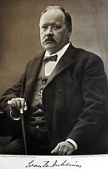
Image of Svante Arrhenius, from Wikipedia.

I still have some science to cover – but I’d like to take an aside and write something about the history of our understanding of the climate science.

Joseph Fourier, in 1820, was the first person to realise what the very simple calculation that I described in Climate Lesson 4 that calculates that the temperature of the Earth “should be” much colder than it is. Blackbody radiation would not be fully understood for another 80 years, so his calculation was based on somewhat different premises, and you can read those for yourself (in old-fashioned French) in his paper. He recognised that somehow the incoming radiation must make it through the atmosphere easily, but that the outgoing radiation from the Earth would be blocked in some way by the atmosphere.

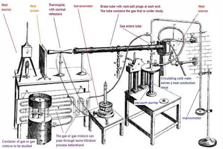
Tyndall’s experimental equipment from Wikipedia

In the 1850s, John Tyndall was able to measure the amount of heat absorbed by different atmospheric gases and he concluded that the “Greenhouse effect” that Joseph Fourier had surmised was dominated by water vapour absorption and that carbon dioxide had a smaller, but observable heating effect too.

Svante Arrhenius, in 1896, published a significant paper “On the influence of Carbonic Acid in the Air upon the Temperature of the Ground” (available in full here – this one is in English). In this he calculated that doubling the amount of carbon dioxide in the atmosphere would lead to a temperature rise of around 4 ºC.  I’m amused by how he starts his discussion section with “I should not have undertaken these tedious calculations if extraordinary interest had not been connected with them…” The extraordinary interest was to understand the causes and effects of natural climate variations during and between ice ages, but he already realised:

“The following calculation is also very instructive for the appreciation of the relation between the quantity of carbonic acid in the air and quantities that are transformed. The world’s present production of coal reaches in round numbers 500 millions of tons per annum … Transformed into carbonic acid, this quantity would correspond to about a thousandth part of carbonic acid in the atmosphere …

In a later book he would go on to say that burning coal would have a positive effect on the planet as it would stop the next ice age and would allow more crops to grow (I assume as he was living in Sweden, that he could only imagine warming in a positive way). He did, however, think it would take a 1000 years for humanity to double the carbon dioxide in the atmosphere – he assumed a linear, rather than exponential, increase in our burning of coal (we are on track to have doubled it in 150 years).

[The IPCC AR5 report (see page 82 in the Technical Summary) in 2013 stated that the “Equilibrium Climate Sensitivity” (impact of a step doubling of CO2 in the atmosphere and the planet going into equilibrium thereafter) is “likely between 1.5 ºC to 4.5 ºC”.]

But Arrhenius’s paper was met by a strong criticism by Knut Ångström. Ångström, and his assistant “Herr J Koch”, were doing absorption experiments with carbon dioxide and realised two things that seemed to suggest problems in Arrhenius’s work. First, they changed the amount of carbon dioxide in glass tubes and measured how much infrared radiation was absorbed. Their measurements suggested that carbon dioxide absorption saturated very quickly, meaning that very quickly all the infrared was absorbed and increasing the amount of carbon dioxide made no difference beyond this point.

Even more convincingly, they also showed that water vapour had absorption bands that overlapped the carbon dioxide bands – meaning that those wavelengths were already completely absorbed by water vapour.

This time – around the turn of the 20th Century – was a time when there was a real “greenhouse gas debate”. These two excellent scientists were arguing about confusing evidence and an incomplete and necessarily highly simplified conceptual model of the Earth system.

The assistant Koch’s observations actually didn’t show that there was no difference in absorption as the carbon dioxide was increased – he saw a 0.4 % decrease, which Ångström dismissed as trivial. (Modern calculations suggest he should have seen a 1 % decrease, and this suggests that Koch and Ångström underestimated their uncertainties). 

Arrhenius published a long response (this time in German) to explain why Ångström was wrong – he apparently (I haven’t been able to access the full text) correctly realises that Ångström was oversimplifying his analysis – the spectral bands of water vapour and carbon dioxide do not fully overlap (we also now know carbon dioxide absorption is not fully saturated), but most importantly, the atmosphere is not like a single thin sheet of glass – it has layers, and while the lower layers may mostly absorb the infrared, the outer layers are drier (less water vapour) and the atmosphere itself emits thermal infrared radiation.

Other scientists seem not to have noticed, or understood, Arrhenius’s 1901 paper, and the assumption that Ångström had proven Arrhenius wrong limited research in this area for many decades. Furthermore, there was growing recognition that the Earth itself could, and would, regulate any increase in carbon dioxide by absorbing it mostly in the ocean, and, with any that the oceans didn’t absorb, in increased growth of trees, peat bogs and so forth. The Earth would sort itself out, there wasn’t that much coal anyway and we weren’t (then) burning it fast enough for there to be a problem. (We now know that there are limits to that absorption too – I’ll come back to that).

It was Guy Stewart Callendar who, in the 1940s and 1950s, revitalised the Arrhenius ideas. He, as a hobby, started compiling temperature measurements since the 19th century and started to see an upward temperature trend (we now know that trend was not based on the relatively low increase in carbon dioxide, but on natural effects). To understand this he re-investigated the absorption of carbon dioxide and newer observations that provided more detailed spectroscopy of carbon dioxide absorption; he started to make a coherent model of the atmospheric effect. His papers influenced scientists to start systematic measurements of carbon dioxide in the atmosphere (although he also got a lot of criticism). Charles Keeling started taking Mauna Loa observatory measurements in 1958 as a response (see my earlier blog on that).

Now my opinion on all this: I’ve been reading climate sceptic blogs and webpages and many of them gleefully say that “the first climate alarmist Arrhenius, who was an amateur scientist, was proven wrong by the much better scientist Ångström…” In this they are misunderstanding the whole scientific method (and confusing Ångström with his father). Both Arrhenius and Ångström were good scientists who were working on limited information, poor models and experiments that were in their very early days. Both made mistakes of understanding – but both also showed new concepts that were essential pieces of the jigsaw that more recent scientists have put together. Most importantly – this argument is over – we now understand what neither of those scientists understood, we have better observations of everything from the absorption spectra of carbon dioxide and water (using similar  experiments to those of Ångström and Koch, but with more sophisticated analyses) to the atmospheric composition and we have models that split the atmosphere into far finer levels than Arrhenius imagined, and which also include clouds and atmospheric circulation (that he couldn’t include).

Oh, and as a personal note, when I was at Imperial College in the mid 1990s, I won both the Tyndall and the Callendar prizes. It’s nice to be building on their work!

Lesson 13: Total Solar Irradiance

comp_neu_42_65_1709
Total Solar Irradiance Composite. From: https://soho.nascom.nasa.gov/gallery/helioseismology/large/vir011.jpg

The Sun, providing almost all the energy we receive, is the driver of our climate. Therefore one of the core parameters needed to understand the climate is a quantity called “total solar irradiance” (TSI). TSI is measured in watts per metre squared and is a measure of the incoming energy from the Sun into a square metre every second. Note that even that definition needs some caveats – the irradiance of the Sun will depend on the angle the ground is to the Sun and will depend on the distance between the Earth and the Sun which changes a little over our year’s orbit. So, it’s defined as the “straight on” area – something like at the Equator at noon – and for the average distance between the Earth and the Sun over the whole year. The “Total” in total solar irradiance means that this is the Sun’s output at any wavelength of light and distinguishes it from “spectral solar irradiance” where we measure how much light there is at each wavelength individually.

The graph at the top represents the satellite observations of total solar irradiance over the last 40 years. Because the Sun is the driver of the Earth’s climate, it is absolutely essential to understand these data. The coloured lines you see represent the daily values – there’s a lot of natural variation. This is because the Sun has something akin to “weather” – the Sun’s activity can vary significantly and it becomes more and less active depending on the exact processes going on in the upper regions of the Sun. The grey line is a rolling average of that weather – akin to a measure of the Sun’s climatic state.

We’ve been monitoring the Sun’s activity since 1611 when the first telescope observations of Sun spots were made. (The Wikipedia article on Sunspots also says that sunspot observations go right back to the Chinese Book of Changes in 800 BC). When the Sun is particularly active there are lots of Sunspots and when the Sun is not very active there are fewer Sunspots.

If you look at Sunspot numbers over the last 400 years, you see there is a regular 11 year cycle for most of this time where Sunspot numbers increase, then go to almost zero and then increase again. This is known as the “solar cycle” and it is also visible in the satellite observations at the top of the page – the total solar irradiance is higher when the number of sunspots is higher.

Sunspot counts since 1610, from Wikipedia article on Sunspots

You can also see from the 400 year record that there were times when the number of sunspots was extremely low. This is especially true in the very early record with a long “Maunder Minimum” with almost no Sunspots observed at all from 1650 to 1700. That time period also corresponds to the “Little Ice Age” which may have had multiple causes, including because of the Sun’s lower total solar irradiance.

Clearly, the total solar irradiance is a variable quantity and therefore it is essential that climate models include TSI in their analyses. The satellite observations that make up the graph at the top are our best estimates of this quantity – mostly because they are measuring the pure sunlight, unfiltered by the atmosphere. Any observations from the ground (and the best of those are made in Davos, Switzerland at the “World Radiometric Reference”) will lose some light to the atmosphere and that loss will depend on the weather conditions.

In my last blog I showed how even with something as simple as “temperature” there needed to be some thinking about how to interpret and analyse the data to give meaningful information that could be used by climate scientists. On my facebook page someone asked me how you can tell if data are “manipulated” and I’ve been meaning to talk about TSI since then because TSI data must be analysed carefully before being used.

The first clue is in the title of the graph at the top of the page. It describes this record as a “composite”. That means that people have combined data from multiple sources and that almost always means that some analysis is required. If you know how to find scientific data, you can relatively quickly find the graph of the “raw” data.

See the source image
Total Solar Irradiance raw data from different satellites. From Kopp (2014): http://dx.doi.org/10.1051/swsc/20140

The colour scale is slightly different from the top graph, but you can see from the names of the satellites that these are the same satellite observations. When you see the raw data you see why analysis is required – there are noticeable step changes between satellites. Furthermore, at times when more than one satellite was observing simultaneously, you can see that some of the detailed shape is also different.

These differences are because the satellites themselves have slightly different methods for measuring the TSI. All of them use a basic “electrical substitution” technique – they have black cavities that absorb the sunlight and heat up and they compare the temperature rise from the sunlight with the temperature rise that they get using an electrical heater. But there are differences in exactly how they absorb the sunlight and in exactly how they compare the solar heating with the electrical heating. Each satellite instrument manufacturer has made the best attempt at getting that heating equivalent – but there are real differences between satellites because there are real differences between approaches. When I first showed this graph in talks in 1999, I used to say “but you can see that more recently the lines are closer together” and then ACRIM3 and TIM V15 were launched. TIM V15 used a far more accurate technique to do the electrical substitution and that showed a step change. Instruments also change once they are in space – the sunlight they are absorbing contains considerable amounts of extreme ultraviolet that is very damaging to the instruments – the black absorber might go a bit grey, the electrical heater might not be as powerful – and they also get hit by solar wind particles which are even more damaging.

It’s also important to remember that scientists do put “uncertainty estimates” on their observations. And those “uncertainty estimates” are larger than the differences between satellites.

The TSI composite you see at the top is the best estimate by scientists of how to take all this into account. They choose the most stable satellites, they correct for instrument drifts based on models of how the instruments degrade, they “bias correct” the step changes between instruments, they link to the ground observations from Davos and they make their best composite analysis of what the Sun is doing. Different groups around the world have their own best composite and those different composites disagree – and in meeting rooms all over the world scientists argue about the exact details of this composite.

These are real data and real data are always messy. They always need analysing and interpreting by real experts who understand why those differences exist. I’ll write a separate “opinion blog” about how this is over-interpreted by climate sceptics. However, here I’ll just note that when TIM V15 was launched, the TSI was changed downwards. That was taken into account in the modelling and is part of why the older models showed subtle differences to the newer models. But none of that changed the underlying story that anthropogenic greenhouse gases are the dominant cause of recent warming. (Just because we don’t know everything [e.g. about the exact value of TSI] doesn’t mean we know nothing [e.g. the relative effects of anthropogenic greenhouse gases and solar changes].)


Lesson 12: Measurements of temperature

EUROPE-United_Kingdom--1884-2018-MO
UK temperature stripes from #ShowYourStripes (https://showyourstripes.info/). This shows all the years from 1884 (left) to 2018 (right). The coldest average year is dark blue, the hottest average year is dark red and the other years are coloured between these.

#ShowYourStripes is a visualisation tool for showing the changing average temperature over the last ~150 years. You can go to their website and find “your” stripes – for your country or another one. Have a look at several countries. I found it interesting to compare New Zealand to Syria and the Central African Republic. I haven’t found a country yet that isn’t more red on the right and more blue on the left.

But, what does “average temperature” mean? Fortunately, almost all the data we have collected is made publicly available, for free. This means that we can all do our own research and understand what’s happening. Granted, some free data requires expert analysis, but “temperature” is a concept we can all understand (and many of us can measure ourselves in our own garden).

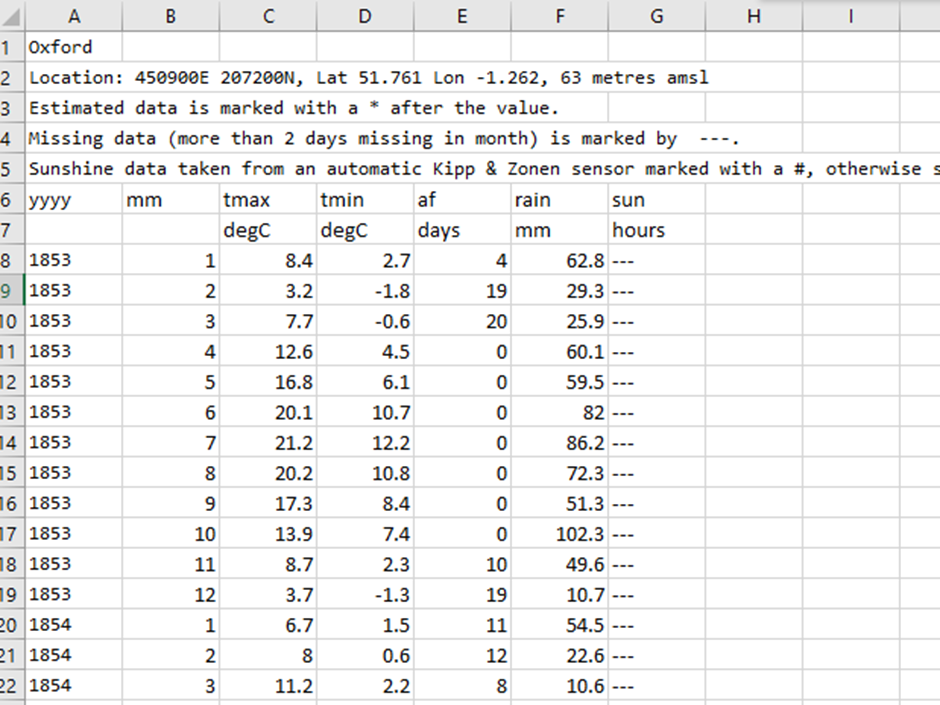
On the UK MetOffice website, you can access historical temperature records for anywhere in the country. I downloaded the data for Oxford and imported them into Microsoft Excel. The data look like this.

Oxford raw data
Screenshot of the Oxford data after they have been copied into Excel

The first column is year, the second is month. What you then have are the average maximum temperature for all days in that month and the average minimum temperature for all nights in that month. It also gives the number of days with air frost, the total rainfall over the month in mm and the total hours of sunshine that month (from 1929 onwards).

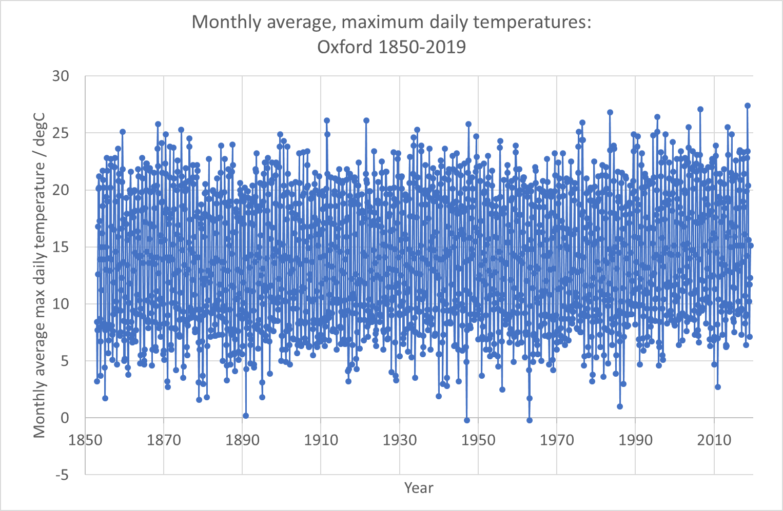
The first thing I did was plot the data (this was almost as simple as it sounds – the only step I did was to create a year-month as a decimal year using the simple formula =YEAR+(MONTH-1)/12. When I had done that it looked like this:

Plot1Oxford data
My raw plot of the Oxford data using Excel’s basic plotting function

Now, this plot shows us the first problem with observing any climate record – seasonal variations are always far larger than the climate trend you are looking for. And this is based on the monthly average of the maximum temperature. If we plotted daily maxima or hourly values it would be even more all over the place! This is why all observational data is “manipulated”. It’s impossible to see what you’re looking for in raw data – raw data variations are dominated by the diurnal cycle (night and day) and by seasonal cycles and by noisy weather. There are also longer-term effects (like the El Niño) that affect a few years.

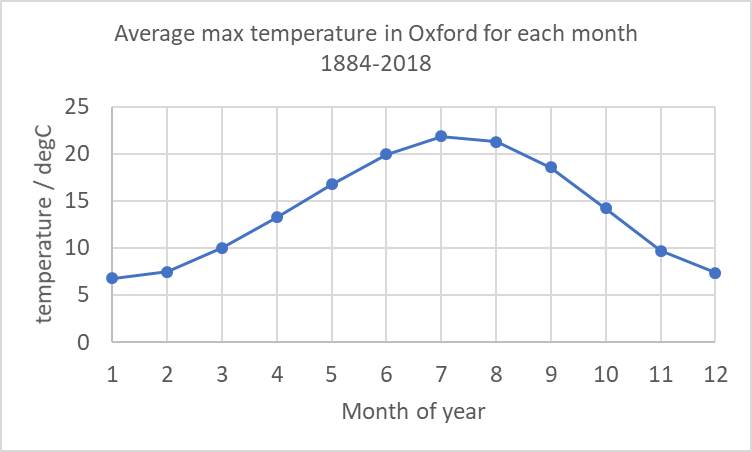
I’m therefore going to do my own manipulation of this data. The first thing I did was to determine an “average January”, “average February” and so on. These involved averaging all the Januaries, all the Februaries etc for the whole timescale. (In Excel I did this using =SUMIF($B$8:$B$2003,N8,$C$8:$C$2003)/COUNTIF($B$8:$B$2003,N8) – which sums and counts all max temperatures (C column) if the B column (month) is equation to “N8” which was 1 for January (N9 was 2 for February etc) and calculates an average. I’m putting this in to help you do the calculation for your choice of weather station! It is good scientific practice to make my work “reproducible” and to show you exactly how I got what I got.).

Oxford plot 2
My calculation of the average of the monthly average max temperatures for each month over the whole time range.

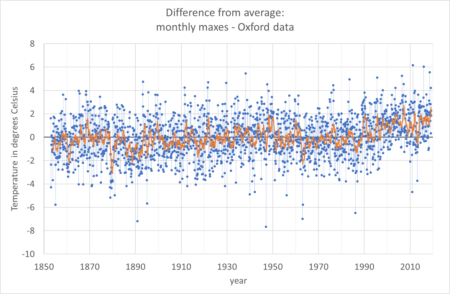
Having done this, I calculated for every value in the record the difference between the actual value for that month and this “typical” value for the whole record. (In Excel I used: =K8-VLOOKUP(B8,$N$8:$O$19,2) where “K8” was the actual value and the “vertical look up” picked the right month from my table of monthly averages.)

The results are the blue dots in the graph below. You can see that the blue dots are still very noisy, but now the temperature range is about plus and minus 4 degrees Celsius, whereas in the earlier picture it was from 5 degrees Celsius to 25 degrees Celsius.

Oxford plot 3
Difference between actual data and average for each month (blue dots) and a 12-month rolling average of that (orange line)

If you look at the blue dots you do begin to see a trend from 1990 onwards – the number of blue dots below the line (average max temperature in that month was colder than the average for the entire data set) are much fewer. But to see a trend I have to do yet more averaging. The orange line is a rolling average of 12 months (that means that for every point I have averaged it with the 6 points before and the 6 points after). In the orange line you can see an upward trend since 1990.

What I hope I’ve shown here is that even for a simple measurand like “maximum temperature in a day averaged over a month” there is a lot of work to do to interpret the data to see climate trends. What I haven’t shown is the other interpretations that are needed. The MetOffice has changed the way it does these measurements since 1884, probably several times. And some work is needed to ensure that the new data are consistent (interoperable) with the older data.

Note that on their historical data website, the MetOffice says for this data:

No allowances have been made for small site changes and developments in instrumentation.

I hope I’ve also shown that the data are available and that you can handle them yourself in order to interpret them. You can, with enough detective work, go all the way back to the rawest data and understand all the ways the data has been processed and interpreted to get to simple messages – like the #ShowYourStripes diagram at the top of this page.

Interestingly, #ShowYourStripes has also done Oxford separately from the whole UK. I’m not completely sure why I chose it (I did want to avoid major cities and I wanted a place where the record quality was likely to be very good), but they made the same choice. Here are the Oxford stripes. I think these correspond to my orange line (actually theirs are likely to be the average of the blue dots in my graph above for each year, which is slightly different from my rolling-average orange line: it’s probably the value of my orange line for each July).

EUROPE-United_Kingdom-Oxford-1814-2018-MO
Oxford temperature stripes from #ShowYourStripes. Try to compare with my orange line


Lesson 11b: How do we know it’s fossil fuel burning?

As I was writing about carbon dioxide levels rising in the previous post, I began asking myself what evidence we have to support that the rise is caused by fossil fuel burning by us – rather than from natural causes. That set me off down different paths – which I’ll explore with you here. I’m not an expert on any of these topics, but I know how to think about things in a scientific way – so here are my explorations.

radiocarbon_sub1
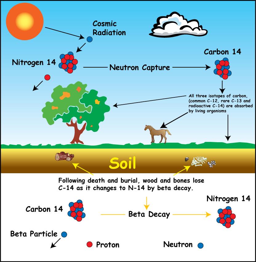
Principles of carbon dating. Image from http://rses.anu.edu.au/services/anu-radiocarbon-laboratory/radiocarbon-dating-background

First, I wondered about whether the carbon dating techniques would teach us about this. Carbon dating is a technique used to work out how old wooden objects are. It works like this: In the upper atmosphere, nitrogen atoms are hit by cosmic rays and are converted into carbon-14 (carbon atoms with 6 protons and 8 neutrons). Carbon-14 is radioactive and it decays, slowly, back to nitrogen (7 protons, 7 neutrons). If you have a large number of carbon-14 atoms, then after ~5730 years, half of them have decayed back to nitrogen (that’s what a half-life means). In the atmosphere, the cosmic rays keep making new carbon-14 atoms. A growing tree will take in carbon-14 as well as the other isotopes of carbon (carbon-12 and carbon-13) from the atmosphere while it is alive. Once it dies, there is no more carbon-14 coming in from the atmosphere but the carbon-14 that is in the wood continues to decay into nitrogen. So, if a boat or a chair was made from a tree, you can tell how old it is by seeing how much carbon-14 is left in it. Every ~5730 years the amount of carbon-14 halves.

Now, fossil fuels are fuels made from fossilised wood that grew hundreds of millions of years ago. So, there have been many, many half-lives that have passed, and there is no carbon-14 left. I wondered whether, as a result of us burning fossil fuels, the amount of carbon-14 in the air is noticeably lower than it “should be”?

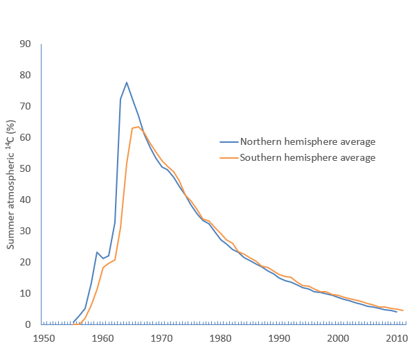
I read quite a few online documents and scientific papers and discovered a couple of things – first that in the early 20th century there was a noticeable “ageing” of the atmosphere – it looked older than it should have done. But then we really messed up the readings by setting off lots and lots of atomic bombs.

Hemispheric_14C_graphs_1950s_to_2010
Image from Wikipedia article. I’m not sure what the vertical axis really means because carbon-14 is never several percent of the carbon, but while I think they’ve missed off a scaling factor, or not explained what it is a percentage of, the shape tells a powerful story – atmospheric carbon-14 went up when we released nuclear bombs

However, that’s now dropping and the scientific paper I found suggests that by 2050 brand new wood might look like it grew in 1050! I’m not completely sure whether that’s based on measurement or projection making the assumption that humans are emitting fossil carbon, but it does provide some evidence that you could test.

There’s also another carbon isotope, carbon-13. This is not radioactive, so doesn’t decay. From that you can tell something about the origin of the material. Photosynthesis affects the ratio of carbon-13 to carbon-12 as it prefers one to the other (I’m massively out of my depth with this chemistry and biology, so I’ll stop there – but apparently there are two types of photosynthesis). Whereas geological processes have no such bias. Therefore, if something was ever a plant, or ate a plant, the ratio is different than if it came from rocks. As a result you can distinguish fossil fuel carbon (from 100s of millions of years old trees that had photosynthesis) from volcano carbon. And the increase in carbon dioxide in the atmosphere shows it comes from plants – but ones that are old enough for carbon-14 to decay: in other words, fossil fuels.

We attempt to track carbon dioxide from volcanoes. There is no where near enough. Even if we’re a lot wrong in that, it’s not enough.

Also the oxygen levels are decreasing at the rate you’d expect if we were burning things. And we know carbon dioxide levels are increasing in the ocean, so it’s not ocean outgassing.

Other evidence that the increase in carbon dioxide comes from us comes from a simpler source – we know how much fossil fuel we’ve dug or pumped out of the ground. Because it has a monetary value, we actually track that very carefully. Basic chemistry tells us that carbon dioxide is a combustion product when we burn fossil fuels (we can also measure that in a laboratory easily). So we can calculate how much increase we’d expect.  The increase in carbon dioxide in the atmosphere is quite a lot lower than what we’d expect from that simple calculation. That’s because the oceans and the trees have taken up a lot of our emissions. But not all. And measurements over them (e.g. by those satellites we talked about in the last lesson) show that they are now absorbing less (the oceans are “saturating” and simply can’t take any more and we’re cutting down, rather than planting, forests). The global climate budget tries to track and measure all this.

(I promise a later blog called “But dinosaurs didn’t drive SUVs” to discuss why carbon dioxide levels were much higher in their days without us).


Lesson 11: Carbon dioxide measurements from Mauna Loa

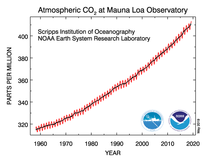
co2_data_mlo
Obtained from https://www.esrl.noaa.gov/gmd/ccgg/trends/full.html. This shows the atmospheric carbon dioxide measurements from the Mauna Loa Observatory

Today I’d like to talk a bit about the observations of climate change. Observations are used both to set up climate models and to test them. That is a bit circular – and where independent data sets exist, different data sets are used for these two roles – but usually the observations are used to tune the model using a method called “data assimilation” which is a mathematical process that tries to minimise the average difference between prediction and observation.

There are three types of observation we need to consider: observations of the quantities that affect the climate, observations of the changing climate and observations of the effects of changing climate. In practice, these three categories are blurred (many observations are both cause and effect).

Today we’ll consider the first of these, and in particular the graph that was published widely in the last week because it measured the highest carbon dioxide levels yet: the Mauna Loa observation of carbon dioxide levels in the atmosphere. As we considered in lesson 7, carbon dioxide is a powerful greenhouse gas that affects the Earth’s radiative energy balance (though not in a simple manner). The Mauna Loa Observatory is on a volcano in Hawaii – right in the middle of the Pacific, and, most significantly, a very, very long way from any meaningful industry. The instruments are at the top of the mountain – 3397 m above sea level – again conditions that keep the observations pure. The observatory has measured carbon dioxide daily since March 1958 by taking samples of air and analysing which gases are inside them.

There is an excellent video at https://youtu.be/gH6fQh9eAQE, which I will embed here:

In the video you can see the observations of carbon dioxide from observatories since 1989. The red dot is Mauna Loa (the black dots are other stations around the world – over time the number of black dots changes as stations come in and out of operation). The upward trend is clear – and this has to be factored into the climate models. The zig-zag pattern is due to the seasons – and in particular due to the summer leaf growth in the northern hemisphere which temporarily removes carbon dioxide from the atmosphere. But the unceasing upward trend behind this is because we’re burning fossil fuels (and, to a more minor extent, because we’re cutting down forests and there are more forest fires).

One problem with these observations is that they are made at only a few sites and these sites are intentionally chosen to be well away from the places where fossil fuels are burnt. There are some satellites that are now measuring global CO2 levels – and these can show where the CO2 is. These work by observing the absorption of the spectrum (seeing how black the black lines are) of sunlight reflected by the Earth in wavelengths we know carbon dioxide absorbs (see back to earlier lessons). In particular they make measurements in a “weak-CO<sub>2<\sub>” band, a “strong-CO<sub>2<\sub>” band and an oxygen O<sub>2<\sub> band. The strong band is a band where carbon dioxide strongly absorbs: this band gives information about the overall absorption of carbon dioxide. The weak band is one where carbon dioxide only partly absorbs. This means it goes through most of the atmosphere undisturbed and gives information about carbon dioxide absorption near the surface: in other words it gives information about whether the surface is a source (e.g. factory) or sink (e.g. forest) of carbon dioxide and to what extent. The oxygen band is a reference band to compare the carbon dioxide against.

The main current CO2 sensor is the NASA OCO-2 satellite which has run since 2014 (OCO failed on launch in 2009).

You can get a video of OCO-2’s observations on YouTube too (https://youtu.be/x1SgmFa0r04)

There’s a joint French-British satellite mission called Microcarb that is currently being built to be launched in 2021 that will also perform satellite-based carbon dioxide measurements.

Aside on climate politics and tobacco

This blog is my opinion.

I am intentionally separating the science of climate change from a discussion of the politics and what we should do about it. Too often, people have conflated the two. I think Al Gore talking about climate change was one of the most damaging decisions ever (and he should never have got a Nobel Prize). Because, and particularly in the USA, people who disagreed with his suggested solutions to the problem, chose to argue with the science, rather than the politics. I think they didn’t understand the difference between different types of “truth”. (I wrote a lot about different types of truth in 2016 and the 2nd-5th posts on this blog are about that). I believe politicians and all of us should be grappling with (and that includes arguing about) what we are going to be doing about climate change. We should not be arguing about whether anthropogenic climate change is real or not.

I am trying to give a faithful and honest account of what I understand about climate change in my lessons. The science is not perfectly known and there are some very big unknowns – for example how positive cloud feedback is – but just because we don’t know everything doesn’t mean we know nothing. The science of climate change will advance and with that advance it will become ever more possible to understand the detail of what’s happening, but we already know the main point: anthropogenic climate change is putting human civilisation as we know it at risk. We either have to stop it (mitigation) or we have to adapt to it. Or perhaps a bit of both.

But we’ve only fully understood this for about 20 years. We’ve had hints before that, and the hints have got stronger and clearer over time, but the clear picture we have now is very recent. I think there are parallels with how we learnt about – and then reacted to – the dangers in tobacco which it’s useful to draw.

The first scientific study on the dangers of tobacco was in 1791. John Hill did a clinical study that showed that snuff users were more likely to get nose cancer. A debate about tobacco in the Lancet started in 1856. In 1889 Langley and Dickenson do the scientific studies that start to explain why nicotine is dangerous. They start modelling the processes by which nicotine effects the cells in our bodies. In 1912 the connection between smoking and lung cancer is first published. The first large-scale scientific analysis of that connection was in 1951. In 1954 the Readers Digest published an article about this and that article contributed to the largest drop in cigarette sales since the depression. In 1962 the British Royal College of Physicians published a report saying that the link was real and in 1964 the US Surgeon General did the same. Cigarette adverts were banned on tv in 1965. Cigarette smoking was banned on the London underground in 1984 – but not for health reasons, instead because a dropped cigarette may have contributed to a fire at Oxford Circus. A comprehensive review about the dangers of passive smoking came out in 1992. Over time more and more things are banned – no smoking zones are introduced in pubs, advertising has bigger warnings …. and eventually in 2003 tobacco advertising is banned in the UK and in 2007 smoking in workplaces is banned in England. Now, 12 years on, I think most of us consider this normal. [I got these dates from an interesting document online: http://ash.org.uk/information-and-resources/briefings/key-dates-in-the-history-of-anti-tobacco-campaigning/]

In 1964 the evidence was clear. We didn’t understand everything – we didn’t understand all the effects of passive smoking, we weren’t quite sure about how a mother smoking affected the fetus in her womb, we didn’t know the link between smoking and cervical cancer or heart disease… but we knew it was dangerous and we took our first steps towards changing it. We had to change people’s attitudes, we had to get people to change how they did things, we had to make smokers uncomfortable on long-haul flights. And people sued the tobacco firms and they fought back – and often won – court cases. It was a long journey that often didn’t go what we now, in hindsight, see as the right way.

I think in climate change we reached that 1964 moment with the publication of the first IPCC report in 1990. There was a lot that that report didn’t know – just like the 1964 tobacco and health reports didn’t know everything either. But equally, it was the first clear report that the problem was real.

If it follows a similar timescale, and I think human nature is such that that’s a good first approximation, that would put climate change in 2020 in the same place as tobacco smoking in 1994. That’s the year some individual organisations made voluntary changes – like Wetherspoons introducing smoke free areas in their pubs, and Cathay Pacific introducing smoke free long-haul flights. It’s also the year that the tobacco companies lost their court battle to stop the warnings being printed in big font on their cigarette packets. There were signs that the numbers of smokers were dropping and British Rail had banned smoking a year earlier – to 85% approval. But there were still 8 years to go before smoking was banned in workplaces – and it probably would have felt too much back then. (I remember being pleased to have a smoke free area in the pub and I didn’t question that the rest of the pub still allowed smoking, I just held my breath walking from the bar to the place I was sitting).

I think that if we’re doing the voluntary stuff now, and the legal stuff catches up with us in 5-10 years – we’ll probably end up ok. But we all need to be talking about this and saying that we want to live in a world where burning fossil fuels seems as old fashioned, unhealthy and odd as smoking in British pubs does today.