Lesson 12: Measurements of temperature

EUROPE-United_Kingdom--1884-2018-MO
UK temperature stripes from #ShowYourStripes (https://showyourstripes.info/). This shows all the years from 1884 (left) to 2018 (right). The coldest average year is dark blue, the hottest average year is dark red and the other years are coloured between these.

#ShowYourStripes is a visualisation tool for showing the changing average temperature over the last ~150 years. You can go to their website and find “your” stripes – for your country or another one. Have a look at several countries. I found it interesting to compare New Zealand to Syria and the Central African Republic. I haven’t found a country yet that isn’t more red on the right and more blue on the left.

But, what does “average temperature” mean? Fortunately, almost all the data we have collected is made publicly available, for free. This means that we can all do our own research and understand what’s happening. Granted, some free data requires expert analysis, but “temperature” is a concept we can all understand (and many of us can measure ourselves in our own garden).

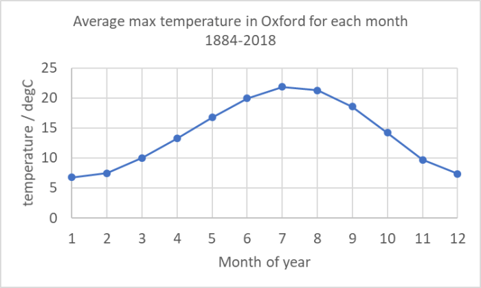
On the UK MetOffice website, you can access historical temperature records for anywhere in the country. I downloaded the data for Oxford and imported them into Microsoft Excel. The data look like this.

Oxford raw data
Screenshot of the Oxford data after they have been copied into Excel

The first column is year, the second is month. What you then have are the average maximum temperature for all days in that month and the average minimum temperature for all nights in that month. It also gives the number of days with air frost, the total rainfall over the month in mm and the total hours of sunshine that month (from 1929 onwards).

The first thing I did was plot the data (this was almost as simple as it sounds – the only step I did was to create a year-month as a decimal year using the simple formula =YEAR+(MONTH-1)/12. When I had done that it looked like this:

Plot1Oxford data
My raw plot of the Oxford data using Excel’s basic plotting function

Now, this plot shows us the first problem with observing any climate record – seasonal variations are always far larger than the climate trend you are looking for. And this is based on the monthly average of the maximum temperature. If we plotted daily maxima or hourly values it would be even more all over the place! This is why all observational data is “manipulated”. It’s impossible to see what you’re looking for in raw data – raw data variations are dominated by the diurnal cycle (night and day) and by seasonal cycles and by noisy weather. There are also longer-term effects (like the El Niño) that affect a few years.

I’m therefore going to do my own manipulation of this data. The first thing I did was to determine an “average January”, “average February” and so on. These involved averaging all the Januaries, all the Februaries etc for the whole timescale. (In Excel I did this using =SUMIF($B$8:$B$2003,N8,$C$8:$C$2003)/COUNTIF($B$8:$B$2003,N8) – which sums and counts all max temperatures (C column) if the B column (month) is equation to “N8” which was 1 for January (N9 was 2 for February etc) and calculates an average. I’m putting this in to help you do the calculation for your choice of weather station! It is good scientific practice to make my work “reproducible” and to show you exactly how I got what I got.).

Oxford plot 2
My calculation of the average of the monthly average max temperatures for each month over the whole time range.

Having done this, I calculated for every value in the record the difference between the actual value for that month and this “typical” value for the whole record. (In Excel I used: =K8-VLOOKUP(B8,$N$8:$O$19,2) where “K8” was the actual value and the “vertical look up” picked the right month from my table of monthly averages.)

The results are the blue dots in the graph below. You can see that the blue dots are still very noisy, but now the temperature range is about plus and minus 4 degrees Celsius, whereas in the earlier picture it was from 5 degrees Celsius to 25 degrees Celsius.

Oxford plot 3
Difference between actual data and average for each month (blue dots) and a 12-month rolling average of that (orange line)

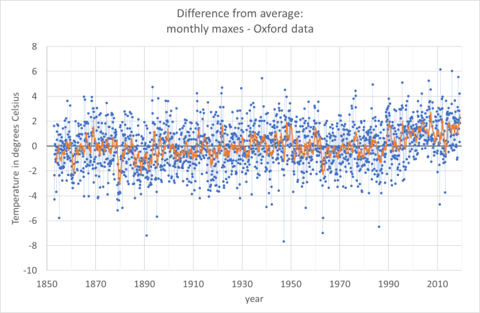
If you look at the blue dots you do begin to see a trend from 1990 onwards – the number of blue dots below the line (average max temperature in that month was colder than the average for the entire data set) are much fewer. But to see a trend I have to do yet more averaging. The orange line is a rolling average of 12 months (that means that for every point I have averaged it with the 6 points before and the 6 points after). In the orange line you can see an upward trend since 1990.

What I hope I’ve shown here is that even for a simple measurand like “maximum temperature in a day averaged over a month” there is a lot of work to do to interpret the data to see climate trends. What I haven’t shown is the other interpretations that are needed. The MetOffice has changed the way it does these measurements since 1884, probably several times. And some work is needed to ensure that the new data are consistent (interoperable) with the older data.

Note that on their historical data website, the MetOffice says for this data:

No allowances have been made for small site changes and developments in instrumentation.

I hope I’ve also shown that the data are available and that you can handle them yourself in order to interpret them. You can, with enough detective work, go all the way back to the rawest data and understand all the ways the data has been processed and interpreted to get to simple messages – like the #ShowYourStripes diagram at the top of this page.

Interestingly, #ShowYourStripes has also done Oxford separately from the whole UK. I’m not completely sure why I chose it (I did want to avoid major cities and I wanted a place where the record quality was likely to be very good), but they made the same choice. Here are the Oxford stripes. I think these correspond to my orange line (actually theirs are likely to be the average of the blue dots in my graph above for each year, which is slightly different from my rolling-average orange line: it’s probably the value of my orange line for each July).

EUROPE-United_Kingdom-Oxford-1814-2018-MO
Oxford temperature stripes from #ShowYourStripes. Try to compare with my orange line


Lesson 11b: How do we know it’s fossil fuel burning?

As I was writing about carbon dioxide levels rising in the previous post, I began asking myself what evidence we have to support that the rise is caused by fossil fuel burning by us – rather than from natural causes. That set me off down different paths – which I’ll explore with you here. I’m not an expert on any of these topics, but I know how to think about things in a scientific way – so here are my explorations.

radiocarbon_sub1
Principles of carbon dating. Image from http://rses.anu.edu.au/services/anu-radiocarbon-laboratory/radiocarbon-dating-background

First, I wondered about whether the carbon dating techniques would teach us about this. Carbon dating is a technique used to work out how old wooden objects are. It works like this: In the upper atmosphere, nitrogen atoms are hit by cosmic rays and are converted into carbon-14 (carbon atoms with 6 protons and 8 neutrons). Carbon-14 is radioactive and it decays, slowly, back to nitrogen (7 protons, 7 neutrons). If you have a large number of carbon-14 atoms, then after ~5730 years, half of them have decayed back to nitrogen (that’s what a half-life means). In the atmosphere, the cosmic rays keep making new carbon-14 atoms. A growing tree will take in carbon-14 as well as the other isotopes of carbon (carbon-12 and carbon-13) from the atmosphere while it is alive. Once it dies, there is no more carbon-14 coming in from the atmosphere but the carbon-14 that is in the wood continues to decay into nitrogen. So, if a boat or a chair was made from a tree, you can tell how old it is by seeing how much carbon-14 is left in it. Every ~5730 years the amount of carbon-14 halves.

Now, fossil fuels are fuels made from fossilised wood that grew hundreds of millions of years ago. So, there have been many, many half-lives that have passed, and there is no carbon-14 left. I wondered whether, as a result of us burning fossil fuels, the amount of carbon-14 in the air is noticeably lower than it “should be”?

I read quite a few online documents and scientific papers and discovered a couple of things – first that in the early 20th century there was a noticeable “ageing” of the atmosphere – it looked older than it should have done. But then we really messed up the readings by setting off lots and lots of atomic bombs.

Hemispheric_14C_graphs_1950s_to_2010
Image from Wikipedia article. I’m not sure what the vertical axis really means because carbon-14 is never several percent of the carbon, but while I think they’ve missed off a scaling factor, or not explained what it is a percentage of, the shape tells a powerful story – atmospheric carbon-14 went up when we released nuclear bombs

However, that’s now dropping and the scientific paper I found suggests that by 2050 brand new wood might look like it grew in 1050! I’m not completely sure whether that’s based on measurement or projection making the assumption that humans are emitting fossil carbon, but it does provide some evidence that you could test.

There’s also another carbon isotope, carbon-13. This is not radioactive, so doesn’t decay. From that you can tell something about the origin of the material. Photosynthesis affects the ratio of carbon-13 to carbon-12 as it prefers one to the other (I’m massively out of my depth with this chemistry and biology, so I’ll stop there – but apparently there are two types of photosynthesis). Whereas geological processes have no such bias. Therefore, if something was ever a plant, or ate a plant, the ratio is different than if it came from rocks. As a result you can distinguish fossil fuel carbon (from 100s of millions of years old trees that had photosynthesis) from volcano carbon. And the increase in carbon dioxide in the atmosphere shows it comes from plants – but ones that are old enough for carbon-14 to decay: in other words, fossil fuels.

We attempt to track carbon dioxide from volcanoes. There is no where near enough. Even if we’re a lot wrong in that, it’s not enough.

Also the oxygen levels are decreasing at the rate you’d expect if we were burning things. And we know carbon dioxide levels are increasing in the ocean, so it’s not ocean outgassing.

Other evidence that the increase in carbon dioxide comes from us comes from a simpler source – we know how much fossil fuel we’ve dug or pumped out of the ground. Because it has a monetary value, we actually track that very carefully. Basic chemistry tells us that carbon dioxide is a combustion product when we burn fossil fuels (we can also measure that in a laboratory easily). So we can calculate how much increase we’d expect.  The increase in carbon dioxide in the atmosphere is quite a lot lower than what we’d expect from that simple calculation. That’s because the oceans and the trees have taken up a lot of our emissions. But not all. And measurements over them (e.g. by those satellites we talked about in the last lesson) show that they are now absorbing less (the oceans are “saturating” and simply can’t take any more and we’re cutting down, rather than planting, forests). The global climate budget tries to track and measure all this.

(I promise a later blog called “But dinosaurs didn’t drive SUVs” to discuss why carbon dioxide levels were much higher in their days without us).


Lesson 11: Carbon dioxide measurements from Mauna Loa

co2_data_mlo
Obtained from https://www.esrl.noaa.gov/gmd/ccgg/trends/full.html. This shows the atmospheric carbon dioxide measurements from the Mauna Loa Observatory

Today I’d like to talk a bit about the observations of climate change. Observations are used both to set up climate models and to test them. That is a bit circular – and where independent data sets exist, different data sets are used for these two roles – but usually the observations are used to tune the model using a method called “data assimilation” which is a mathematical process that tries to minimise the average difference between prediction and observation.

There are three types of observation we need to consider: observations of the quantities that affect the climate, observations of the changing climate and observations of the effects of changing climate. In practice, these three categories are blurred (many observations are both cause and effect).

Today we’ll consider the first of these, and in particular the graph that was published widely in the last week because it measured the highest carbon dioxide levels yet: the Mauna Loa observation of carbon dioxide levels in the atmosphere. As we considered in lesson 7, carbon dioxide is a powerful greenhouse gas that affects the Earth’s radiative energy balance (though not in a simple manner). The Mauna Loa Observatory is on a volcano in Hawaii – right in the middle of the Pacific, and, most significantly, a very, very long way from any meaningful industry. The instruments are at the top of the mountain – 3397 m above sea level – again conditions that keep the observations pure. The observatory has measured carbon dioxide daily since March 1958 by taking samples of air and analysing which gases are inside them.

There is an excellent video at https://youtu.be/gH6fQh9eAQE, which I will embed here:

In the video you can see the observations of carbon dioxide from observatories since 1989. The red dot is Mauna Loa (the black dots are other stations around the world – over time the number of black dots changes as stations come in and out of operation). The upward trend is clear – and this has to be factored into the climate models. The zig-zag pattern is due to the seasons – and in particular due to the summer leaf growth in the northern hemisphere which temporarily removes carbon dioxide from the atmosphere. But the unceasing upward trend behind this is because we’re burning fossil fuels (and, to a more minor extent, because we’re cutting down forests and there are more forest fires).

One problem with these observations is that they are made at only a few sites and these sites are intentionally chosen to be well away from the places where fossil fuels are burnt. There are some satellites that are now measuring global CO2 levels – and these can show where the CO2 is. These work by observing the absorption of the spectrum (seeing how black the black lines are) of sunlight reflected by the Earth in wavelengths we know carbon dioxide absorbs (see back to earlier lessons). In particular they make measurements in a “weak-CO<sub>2<\sub>” band, a “strong-CO<sub>2<\sub>” band and an oxygen O<sub>2<\sub> band. The strong band is a band where carbon dioxide strongly absorbs: this band gives information about the overall absorption of carbon dioxide. The weak band is one where carbon dioxide only partly absorbs. This means it goes through most of the atmosphere undisturbed and gives information about carbon dioxide absorption near the surface: in other words it gives information about whether the surface is a source (e.g. factory) or sink (e.g. forest) of carbon dioxide and to what extent. The oxygen band is a reference band to compare the carbon dioxide against.

The main current CO2 sensor is the NASA OCO-2 satellite which has run since 2014 (OCO failed on launch in 2009).

You can get a video of OCO-2’s observations on YouTube too (https://youtu.be/x1SgmFa0r04)

There’s a joint French-British satellite mission called Microcarb that is currently being built to be launched in 2021 that will also perform satellite-based carbon dioxide measurements.

Aside on climate politics and tobacco

This blog is my opinion.

I am intentionally separating the science of climate change from a discussion of the politics and what we should do about it. Too often, people have conflated the two. I think Al Gore talking about climate change was one of the most damaging decisions ever (and he should never have got a Nobel Prize). Because, and particularly in the USA, people who disagreed with his suggested solutions to the problem, chose to argue with the science, rather than the politics. I think they didn’t understand the difference between different types of “truth”. (I wrote a lot about different types of truth in 2016 and the 2nd-5th posts on this blog are about that). I believe politicians and all of us should be grappling with (and that includes arguing about) what we are going to be doing about climate change. We should not be arguing about whether anthropogenic climate change is real or not.

I am trying to give a faithful and honest account of what I understand about climate change in my lessons. The science is not perfectly known and there are some very big unknowns – for example how positive cloud feedback is – but just because we don’t know everything doesn’t mean we know nothing. The science of climate change will advance and with that advance it will become ever more possible to understand the detail of what’s happening, but we already know the main point: anthropogenic climate change is putting human civilisation as we know it at risk. We either have to stop it (mitigation) or we have to adapt to it. Or perhaps a bit of both.

But we’ve only fully understood this for about 20 years. We’ve had hints before that, and the hints have got stronger and clearer over time, but the clear picture we have now is very recent. I think there are parallels with how we learnt about – and then reacted to – the dangers in tobacco which it’s useful to draw.

The first scientific study on the dangers of tobacco was in 1791. John Hill did a clinical study that showed that snuff users were more likely to get nose cancer. A debate about tobacco in the Lancet started in 1856. In 1889 Langley and Dickenson do the scientific studies that start to explain why nicotine is dangerous. They start modelling the processes by which nicotine effects the cells in our bodies. In 1912 the connection between smoking and lung cancer is first published. The first large-scale scientific analysis of that connection was in 1951. In 1954 the Readers Digest published an article about this and that article contributed to the largest drop in cigarette sales since the depression. In 1962 the British Royal College of Physicians published a report saying that the link was real and in 1964 the US Surgeon General did the same. Cigarette adverts were banned on tv in 1965. Cigarette smoking was banned on the London underground in 1984 – but not for health reasons, instead because a dropped cigarette may have contributed to a fire at Oxford Circus. A comprehensive review about the dangers of passive smoking came out in 1992. Over time more and more things are banned – no smoking zones are introduced in pubs, advertising has bigger warnings …. and eventually in 2003 tobacco advertising is banned in the UK and in 2007 smoking in workplaces is banned in England. Now, 12 years on, I think most of us consider this normal. [I got these dates from an interesting document online: http://ash.org.uk/information-and-resources/briefings/key-dates-in-the-history-of-anti-tobacco-campaigning/]

In 1964 the evidence was clear. We didn’t understand everything – we didn’t understand all the effects of passive smoking, we weren’t quite sure about how a mother smoking affected the fetus in her womb, we didn’t know the link between smoking and cervical cancer or heart disease… but we knew it was dangerous and we took our first steps towards changing it. We had to change people’s attitudes, we had to get people to change how they did things, we had to make smokers uncomfortable on long-haul flights. And people sued the tobacco firms and they fought back – and often won – court cases. It was a long journey that often didn’t go what we now, in hindsight, see as the right way.

I think in climate change we reached that 1964 moment with the publication of the first IPCC report in 1990. There was a lot that that report didn’t know – just like the 1964 tobacco and health reports didn’t know everything either. But equally, it was the first clear report that the problem was real.

If it follows a similar timescale, and I think human nature is such that that’s a good first approximation, that would put climate change in 2020 in the same place as tobacco smoking in 1994. That’s the year some individual organisations made voluntary changes – like Wetherspoons introducing smoke free areas in their pubs, and Cathay Pacific introducing smoke free long-haul flights. It’s also the year that the tobacco companies lost their court battle to stop the warnings being printed in big font on their cigarette packets. There were signs that the numbers of smokers were dropping and British Rail had banned smoking a year earlier – to 85% approval. But there were still 8 years to go before smoking was banned in workplaces – and it probably would have felt too much back then. (I remember being pleased to have a smoke free area in the pub and I didn’t question that the rest of the pub still allowed smoking, I just held my breath walking from the bar to the place I was sitting).

I think that if we’re doing the voluntary stuff now, and the legal stuff catches up with us in 5-10 years – we’ll probably end up ok. But we all need to be talking about this and saying that we want to live in a world where burning fossil fuels seems as old fashioned, unhealthy and odd as smoking in British pubs does today.


Lesson 10: Anthropogenic Climate Change

models-observed-human-natural
Figure from the report  “Climate Change Impacts in the United States: the Third National Climate Assessment” (2014). https://nca2014.globalchange.gov/

In the last few lessons I’ve been talking about climate models and how they can model incredible complexity including energy balance, convection (circulation) in the atmosphere and oceans, and biogeochemical processes. Once we have such models we can do many things. First, the models help us ask questions and test our assumptions. They allow us to explore “what if” scenarios and understand how important certain components of the system are. Second, the models help us to predict the future and third, they allow us to understand what we can, and cannot, influence.

The figure above comes from a US government report published in 2014. It compares two runs of a climate model with observations of “global average temperature”.

The two model runs have a broad shaded area. That represents the uncertainty of the model – it indicates the range that the temperature could be in, based on multiple runs of the model (the so-called “ensemble run”) in which initial starting points (and the sizes of certain effects) are varied from run-to-run in a way that is consistent with our understanding of our lack of knowledge.

Global average temperature is not an easy thing to measure (we’ll come on to that in later lessons), but the black line is the result of our best attempt at combining the data we have. Really it should also have “uncertainty” prescribed to it – I’d prefer to see this graph with a band around the black line too. I don’t know enough about how this value is determined (I’ll try to find out and get back to you!), but my guess is that it has an uncertainty (width) of somewhere between half that of the models and the same size as the models.

The green model band describes “natural factors only”. This runs the model considering all the biogeophysical processes, and also considering the distance between the Earth and the Sun, variations in the solar cycle, volcanos erupting and releasing gases into the atmosphere, trees growing and dying, lightning-caused fires and so on. The blue model band describes “natural and human factors”. It includes all the quantities above, but also includes anthropogenic (human released) fossil fuel burning (coal, oil, gas), cement making, the release of particles in cities (smog, air pollution), refrigerant gases (CFCs and their more modern replacements), methane release in industrial-style farming and landfill waste tips), and land use changes (cities, deforestation). Note that 80% of the observed difference between the blue and green lines is due to fossil fuel burning. The other things make up a further 20% of that.

Until 1980 you can’t tell the difference between the lines. It becomes clear (now, in hindsight) around 1990. But it’s worth remembering that in 1990 our computers were a lot smaller, our climate models a lot less detailed (remember the 1987 storm that the MetOffice failed to predict – that was because the weather forecasts were a lot less reliable then – and the climate models are based on the same programs as the weather models). So while in hindsight it was around 1990 that humans became a driving force in the climate, we’ve only had the science to understand that since about 2010. We are in the very early days of our full understanding of the problem.

I’d like to keep the science and the politics separate, so I’ll write a separate note on my thoughts about this.


Lesson 9b: Seeing the wood for the trees

In Lesson 9 I make a common mistake of describing scientific progress in terms of increasing complexity. I explained about “early” climate models that were energy balance models, “later” climate models that included the circulation/convection of the atmosphere and ocean and “modern” climate models that include all these things and also chemistry and biology.

Since I wrote that I’ve been realising that this, while a nice “story”, is not really true. Because I am writing these blog posts and then scheduling them for publication a few days later, I realised I could edit the previous lesson before it was published, or write this follow on post. I went for the latter option, because I think the “nice story” is easier to follow. I guess in that way it’s like the model itself – the nice story of a progression of complexity is a simple model of the history of climate modelling and one that is very helpful to explain why models have got better over time. The nice story models some “big picture” stuff, but gets a lot of details wrong. A fuller story will describe the detail more accurately, but will be messier and we’ll lose information. We’ll be “unable to see the wood for the trees” – metaphorically in the case of how I tell the history.

Being literally “unable to see the wood for the trees” is one of the reasons why we still use simple climate models today. A thorough modelling of all the details can sometimes lose something. Earlier in my career I came across the concept of the “missing sunlight” – what this was telling us was that the detailed modelling of where incoming sunlight went (some reflected from clouds, some from the surface, UV parts absorbed by the ozone layer, some lines absorbed by atmospheric gases, some absorbed by the surface to heat up the Earth …) didn’t add up to what the big picture model of “energy in = energy out” was saying. In our forest, the treatment of individual trees misses some of the interactions between trees. There’s a similar “missing water” problem in the Amazon rainforest where the total rainfall seemed twice as big as the outflow of water from the Amazon river system. Later it was realised that water wasn’t just evaporating from the rivers and oceans, it was also evaporating from leaves and being released by trees – and that water was raining down again: a large proportion of the rain was recycled.

For all these reasons, simpler climate models have a very important part to play in modern climate research. They help us understand the processes and test the complex models, they allow for faster “experimental” tests of different processes. They make sure we continue to see the wood as well as the trees.

Conversely, the first attempt at a fully integrated climate model that considered many different complex interactions and treated the calculations in a three dimensional way, was in the 1950s. Computer power was considerably poorer then, and the models were less sophisticated in some ways, but there was an attempt to model all the interactions together.

Lesson 9: Inside the climate models

Globe_as_a_grid
Representation of a Global Climate Model (note this image is in multiple places on the internet but none seem to have the authenticity of being the original version

In the last lesson we learnt about Lewis Fry Richardson developing the concept of numerical weather forecasting. In the 1910s and 1920s his idea could not be realised because we did not have sufficient computing power. Today, that computing power exists – indeed of the UK’s top 7 supercomputers, four are at the Metoffice and two at ECMWF (the European Centre for Medium-Range Weather Forecasting). The only one that isn’t used for weather and climate forecasting is at the Atomic Weapons Establishment (and I dread to think what they use it for).

The weather and climate models of today work as Lewis Fry Richardson predicted: they break the Earth and its atmosphere up into little boxes and in each box they predict the change in conditions over a certain defined time step. They then pass that information to neighbouring boxes.

Over time, weather and climate models have become more complex in:

  • The range of phenomena that they include in their models (discussed below)
  • The size of the boxes and time steps (smaller boxes, smaller time steps)
  • The variety of observational data that they bring into the models
  • Their handling of uncertainty in the modelling processes and in the observations
  • Their ability to predict both overall trends and detail (so moving from making predictions for averages to predictions for specific areas)
  • The human and geological behaviour that they can include in the models (fossil fuel burning, deforestation, volcanos etc).

The simplest climate models are “energy balance models” (EBMs). These do what we considered in our thought experiment in lesson 4, extending it as we did in 4b. They generally split the world into rings of latitude. In each ring they consider the energy in (from the sun based on the average amount of sunlight to hit that ring over a day and a year) and the energy out (the reflected sunlight, which depends on the average albedo – that is reflectance, and the thermal infrared Earth emission and thermal infrared emissivity – that is how well it emits that wavelength). The greenhouse effect is included as a temperature increment – the amount that those greenhouse gases cause a temperature rise. Such models can give basic information about the Earth system – and explain the basic temperature changes that we see.

The simple models can also consider some feedback processes. Since 1969 climate models have considered the “sea-ice albedo” feedback. This affects these energy balance equations near the poles. When the temperature of the Earth is cooler, there is more sea ice and that reflects sunlight back to space, reducing the amount of sunlight that heats up the Earth and therefore cooling the Earth further (this was an important feedback mechanism during the ice age). When the temperature of the Earth is warmer, the sea ice melts and the dark sea that is there instead absorbs a much larger fraction of the sun’s light, warning up the Earth further.

Energy Balance Models can also study the impact of changes in the output of the sun (the sun has an 11-year sunspot cycle and is about 0.3 % brighter when there are more sunspots than it is when there aren’t any. During 1650 – 1700 there was a period of time with almost no sunspots (the Observatoire de Paris was taking records daily) and that corresponds to the “Little Ice Age” (though at the same time there were increased volcanic activity and probably a significant regrowth of rainforest in central America after European diseases, introduced by the explorers, wiped out a very large population – both of those factor may also have altered the climate).

However, energy balance models must be superficial when used alone. Instead they are one component of more complex models. The next, and essential, level of sophistication is to add in convection. I mentioned in an earlier lesson that a garden greenhouse does not heat up because of “the greenhouse effect” but because the glass stops the air circulating. We also know that “radiators” in our houses don’t really work by radiating heat, but by setting up circulation patterns in the air in the room (hot air rises). Similar processes happen in the oceans. London (51 degrees latitude North) is much warmer than Ottawa (45 degrees latitude North) because of the gulf stream that transports hot water from central America towards Europe.

Circulation models need to consider the Earth not in latitude bands, but in the small boxes (including boxes on top of each other into the atmosphere and down into the sea) and consider the currents in the ocean and the winds in the atmosphere and how that means water or air is passed from one box to the next. Circulation models also include physical processes in the ocean and atmosphere – how water vapour condenses into clouds and how clouds precipitate into rain and snow. It is circulation models that model “cloud feedback” which we discussed before.

The gulf stream is driven by salt in the sea water. As water travels from the Equator towards the poles, some evaporates, and therefore the remaining water becomes more salty. Salty water has a higher density (is heavy) and sinks and this sinking drives the “conveyor belt”. There’s a nice video from the MetOffice on youtube that explains this.

One topic that has been discussed in the media (and was the basis of a film) is a concerning possible future feedback could be that as the Greenland ice sheet melts, the fresh (not salty) water introduced just at the point where the Gulf Stream sinks, could stop the whole circulation – changing the patterns across the world and, potentially, making Europe colder! The latest IPCC report, however, says that this is “very unlikely”, though there may be changes in how the circulation occurs.

Modern models “coupled climate system models” include more processes, including chemical processes (chemistry in the ocean, in the atmosphere and at the boundary between the ocean and the atmosphere) and biological processes (growth of trees and algae and the chemical and biological changes that creates: e.g. photosynthesis, carbon storage in trees and in the soil, the effects of fire). They also model human effects – from the “heat island” effects of cities to the impact of paving our roads and gardens on the water cycle.

Modern climate models are some of the most complex computer programs in the world, written by huge teams of experts, each concentrating on one small detail, and running on some of the world’s most powerful computers. They are the achievement of huge multidisciplinary teams of physicists, chemists, biologists (and most importantly those working at the cross-over between disciplines: biochemists, biophysicists), computer scientists, engineers and mathematicians. There are approximately 30 teams of scientists who have developed climate models that run on different computers running different codes. Those teams go to conferences together and learn from each other, but each team makes its own decisions about which details to include and how to model them. They also make different decisions about which observational data (the subject of a later lesson) to include.

The Earth System is extremely complicated. Our models are our best attempt to simulate the real Earth. As our science has become more sophisticated, and as our computers have become more powerful, we have been able to include more and more detail into those models. But we must never forget that they are models and not reality in and of themselves.


Lesson 8: The first numerical weather forecast

factory
Painting of imaginary prediction factory, based on Ch.11 of Richardson’s ‘Weather Prediction by Numerical Process’, ink and water colour, commissioned and owned by Prof.J.G.Byrne, painted by and Copyright of Stephen Conlin, 1986. Obtained here.

So, we’ve discussed blackbody radiation and how the hot sun emits electromagnetic radiation at short wavelengths (UV, Visible, near IR) and the much cooler Earth radiates in the thermal IR. We’ve discussed how the Earth needs to reach an equilibrium where the incoming energy matches the outgoing energy and how without greenhouse gases that would be achieved at around -18 ºC, but, because greenhouse gases absorb thermal IR to excite various vibrational modes (make the molecules wobble), a lot of the thermal IR gets absorbed in the atmosphere and the Earth warms up.

I hope I’ve expressed two core concepts: these processes are all basic physics and chemistry in and of themselves, but there is complexity in the Earth system because of interactions and feedback loops. It’s not quite as simple as more CO2 means more vibrating molecules and hence more warming: increasing CO2 does cause warming, but to understand how much, you need to understand exactly how the light interacts with all the molecules and how the atmosphere itself radiates and how increasing atmospheric temperature holds more water vapour which also acts as a greenhouse gas. It’s both very simple – and very complicated!

Now, a slight aside to get to how that complexity is handled. Back in World War 1 a young Quaker (this is a subject that brings together both my faith and my science!), Lewis Fry Richardson was working in the Friends’ Ambulance Unit in the trenches. By day he dealt with the wounded and the dying. And at night he solved differential equations. I get that: after the horrors of the day, maths provided the rational logic that helped him control emotions.

What he was trying to do was to make the first weather forecast. He had weather measurement data for an area in Central Europe and he decided he’d try to predict the temperature in one place by using what had happened six hours earlier in other places. He had the concept of the first numerical weather forecast. The idea was simple; he would split his map up into lots of different cells and then in each cell he would know both the current temperature, pressure, wind speed and direction and, crucially, how that was changing with time (what in maths is known as “the differential”). He’d solve the differential equations in each cell and that would pass information to the next cell. That way he could calculate numerically what the weather would be a six hours later in one of his cells. He spent six weeks on his calculations – and ended up with the wrong answer (I know that feeling too!). We now know that his wrong answer was because of problems with the input data (the measurements of temperature and pressure that he had were not reliable enough – we’ll certainly come back to that message since my job is to make sure the measurements that go into models are reliable!)

However, his principle was right – you can predict the weather in one place by cutting the Earth up into lots of cells, using measurements and estimates of the current conditions in each place and the rate of change of those conditions, and then solving numerically the differential equations in each cell to show the change until the next time period. He knew that it had taken him 6 weeks to calculate the one cell he was working on, but he imagined that if there were 64000 (human) calculators working together, they could do real time weather forecasting and predict the future. His concept of a “weather forecast factory” (illustrated above) and is exactly what is done in the supercomputers that run today’s weather forecasts.

We’ll go into them in more detail in a later lesson, but basically numerical weather forecast models split the Earth and its atmosphere and oceans into lots of “cells” – boxes that cover a certain longitude and latitude at a particular atmospheric height (or ocean depth). In each box they model the basic physics of radiation (heat, light, temperature) and convection (air/water pressure and winds/water currents) in each box and solve differential equations to show how that is changing over a defined time step. Modern models also model the chemistry (how gases in the atmosphere interact with each, changing salinity and pH of the oceans) and biology (growth of plants and algae, respiration) as well as the large scale geoscience (sun irradiance changes, volcanoes, …).

Numerical weather forecasts are some of the most complex computer programs in the world, being run on some of the biggest and most powerful computers in the world.

The “short term weather forecast” models (which can accurately predict ~3-5 days), the “medium term weather forecasts” and the “climate forecasts” all run exactly the same model at the UK MetOffice – they just use smaller cells and do the calculation on a much finer time scale for weather forecasting and use bigger cells and averages over a month on the climate forecasting. Each meteorological office has its own model developed by its own scientists and programmers – and even within one meteorological office they may have multiple variations of their model. That’s how they can say “there’s a 70% chance of rain” – what they mean is that when they ran their model many times with minor changes to account for what they didn’t know, 70% of the models put out rain and 30% didn’t.

Now I know what you’re thinking! If you’re British and older than 40 you’re remembering Michael Fish on the BBC saying there wouldn’t be a hurricane the day before the 1987 storm. I remember that day vividly as I tried to cycle to school around the fallen trees and got there to find school was closed – which is sort of the point – I couldn’t check in advance if school was closed because there was no (well no established) internet: computers were significantly less powerful back then. The weather forecasts of today are much more sophisticated and much more accurate. But, granted, they are only accurate for around 3-5 days (and we all know there is a limit – the famous “butterfly effect” that means minor changes make big differences to a chaotic system – so we can’t predict more than about 10 days ahead, no matter how sophisticated our models and how powerful our supercomputers).

So how can we predict climate with the same models? The reason for that is that with climate we’re asking a somewhat different question – instead of asking “what will the temperature be at Heathrow at 10 am on the 3 June 2080?” we’re asking “what will the average temperature be for all Junes in the 2080s in outer London?” That’s a different question – and ones the models, with bigger cells and more time averaging, can answer.

Aside on Lewis Fry Richardson

When I started this blog as “Scientific Quaker” back in 2016, I intended to write about science and faith (and some of the earliest posts are about the difference between religious and scientific truth and include my thoughts on faith). When people started asking me to move the Climate Lessons to a blog I did think about whether to start a new one or continue with the 2016 blog and eventually I chose to continue here.

But now my Climate Lessons have got onto Lewis Fry Richardson, I feel I can indulge myself in discussing this other “Scientific Quaker” and the difficulty of choosing between faith and career. (For what he did scientifically see here: Lesson 8: The first numerical weather forecast)

I don’t know a lot about him, beyond what is easily available on online searches, but I’d like to share what I do know.

Both “Richardson” and “Fry” are big Quaker names and I’m guessing he was brought up in families that had been Quaker for generations. In the 19th century, Quakers couldn’t go to university, and intelligent Quakers set up businesses instead. His father was a successful leather manufacturer. That had changed by the turn of the 20th century, though, and Lewis Fry Richardson went to Durham and then Cambridge Universities.

He did several different jobs – he was a generalist who found it hard to find the subject that really spoke to him – but eventually he settled in the Meteorological Office where he started to think about weather forecasting. In those days forecasts were based on pattern recognition – in other words they would find the last time the weather map most closely matched today’s map and then assumed that tomorrow’s map would be what the day after that last one was. Richardson realised that it might be possible to predict the weather based on an understanding of the physics behind the processes instead.

image-2-richardson_lewis_1_f_01
Lewis Fry Richardson’s Friends’ Ambulance Unit personnel card. From: http://engineersatwar.imeche.org/features/friends-ambulance-unit

In January 1916 Britain introduced conscription when they realised that the war was going to go on far longer than earlier optimism had suggested. Quakers generally do not believe that any violent conflict can be compatible with a Christian faith and the young men of Britain’s Quaker meetings struggled with the decision of how to respond to the Peace Testimony of their faith and the conscription law. Some Quakers became absolute conscientious objectors – refusing any form of military activity and going to prison for these beliefs. A small number felt that their conscience required them to fight with their fellow countrymen. The majority of Quakers, though, joined the “Friends’ Ambulance Unit” which was created in 1914 as a response to the horrors of casualties in the war. The Friends Ambulance Unit served in both world wars to treat the injured of all sides – and after the second world war in helping displaced people and people released from concentration camps. (My grandmother’s cousin also served in it in the second world war).

At the end of World War One, Lewis Fry Richardson returned to the Meteorological Office, but in 1920 it became part of (what was to become) the Airforce, and he felt he had to resign. (It remained linked to the Ministry of Defence until 2011, when it became linked to the governmental department BEIS: when I graduated in the late 1990s intentionally ignored adverts for the MetOffice for the same reason that Lewis Fry Richardson did).

He did, however, write up his thoughts on weather forecasting in his book Weather Forecasting by Numerical Methods, which he published in 1922 and he worked on new ideas – but he destroyed all his work when he realised the military could use it to predict where poisonous gas bombs (chemical weapons) would disperse.

Instead, he applied the same concepts to trying to predict the likelihood of war – using equations to understand how much countries were preparing to fight each other. For those calculations he had to work out the length of the border between two countries – and that’s when he realised that borders were fractal (if you make your straight ruler shorter, it goes round more wiggles, and the border is measured as longer). But other than a few details like that (his fractal borders were described in the famous 1967 paper by Benoît Mandelbrot who developed the concept of fractals more generally), Richardson’s work in predicting the chance of war was ignored by everyone (I understand a few modern researchers of peace studies are looking at it now – Lancaster University now has a “Richardson Institute” for Peace Studies named after him). He ended up being a physics teacher in a tech college – the only job he could get with his record as a conscientious objector and his unwillingness to work for the MetOffice.

This story challenges any Quaker working in science today. In hindsight it seems a huge waste of his talents for him not to have worked for the Met Office. And yet, the Met Office was heavily involved in decisions in World War 2 that chose the best dates for bombing civilians in Germany. They still are used for the military. However, his resignation did not stop any of that happening.

I have always refused to work on military projects and, fortunately, that has had no real impact on my career (and has even got me out of a few projects that went wrong). But there are always grey areas. I’m setting up a large consortium at the moment that involves lots of scientists working on the observations that form the basis of climate models – and there are scientists from the navies of two countries who have asked to join the consortium.


Lesson 7: Carbon dioxide as a greenhouse gas

Lesson 7: Carbon dioxide as a greenhouse gas
CO2_H2O_absorption
Photo found on web, attributed to Robert Rohde’s “Global Warming Art” which I can’t find a live link to.

I showed the picture above in the previous lesson and discussed how water vapour absorbs a very broad set of wavelengths in the thermal infrared (and a few in the near infrared). This absorption is due to how the light of those wavelengths causes the water molecules to change their vibrational modes in lots and lots of different ways.

The carbon dioxide molecule has three atoms arranged in a straight line: a carbon atom in the middle and two oxygen atoms either side. It doesn’t have quite as many ways of vibrating as water, but it has quite a few – and crucially different ones (pink in the diagram above), so it absorbs thermal infrared at wavelengths that water vapour cannot respond to. Thus, carbon dioxide removes even more wavelengths that the Earth can use to cool down in outgoing radiation.

In the last lesson, I also described the water feedback loops – simplistically if there’s too much water vapour in the atmosphere it rains. More completely, a higher temperature means both more water vapour in the atmosphere as hot air holds more water – creating more heating – and it means more clouds which may either accelerate warming (trapping heat in at night), or slow down warming (reflecting more sunlight in the day time) – but we’re not quite sure which.

We are increasing the amount of carbon dioxide in the atmosphere (we’ll come back to the evidence for that later – but basically, for most of the last ten thousand years there were 250-280 carbon dioxide molecules in a million air molecules and now there are 400). And there isn’t a feedback loop as simple and immediate as “rain” to get rid of it. There are ways it can naturally come out of the atmosphere: the main ones are increased plant growth (eg in rainforests) and increased ocean algae. The oceans can also absorb some carbon dioxide, but that makes them more acidic which impacts marine life – particularly corals. Of course, if we’ve cut down the rainforests (which we really have) they can’t absorb as much carbon dioxide either.

Because I’m still taking about the basic physics, I want first to consider what the increased carbon dioxide (wherever it comes from) does.

Now you might think that’s easy – CO2 is a greenhouse gas so more CO2 means more warming; but that isn’t directly true. The atmosphere is very thick – so the thermal infrared meets lots of carbon dioxide molecules on the way up: that means that the atmosphere already absorbs all the light at some wavelengths (the ones where the graph above touches the top of the image). Increasing the concentration of carbon dioxide might make it be fully absorbed slightly earlier, but you can’t be more absorbed than fully absorbed (and at some wavelengths it only takes 25 metres of air to block the light completely).

Instead there are two important effects. The easier effect to understand is that not all infrared wavelengths are completely blocked by the atmosphere. In the last lesson I showed a graph of atmospheric absorption zoomed in and there you see lots and lots of thin lines. As the concentration of carbon dioxide in the atmosphere increases, some of those lines get broader, and some of them get deeper. For example, some wavelengths represent changes from an unusual vibrational mode to another, that are rarely “set up” – it’s rare for the light to meet a molecule in the right starting state, but when there are more carbon dioxide molecules, the light is more likely to find one of these rare molecule vibrational states, so those wavelengths are more frequently absorbed and the absorption line deepens.

The more subtle effect is that the atmosphere itself is also lots of little blackbodies radiating thermal infrared blackbody spectra that depends on the temperature of the gases. (As the thermal infrared radiation is absorbed by the carbon dioxide and water vapour in the atmosphere it heats the atmosphere up).

At low altitudes, any infrared emitted by the atmosphere is absorbed by the carbon dioxide molecules and can’t make it through. But there is a height where the atmosphere can radiate to space because there aren’t enough carbon dioxide molecules above it. Increasing the concentration of carbon dioxide means more molecules throughout the atmosphere and therefore this level has to go up towards space (at the lower height where light once could escape it now is more likely to hit other molecules and therefore not escape). Since the higher parts of the atmosphere are colder, there is less energy escaping to space than would be there at lower levels (smaller blackbody curve at lower temperatures) – so the planet loses less heat.

co2SaturationMyth_Atmosphere_med
Image from: https://skepticalscience.com/graphics.php?g=104

Eek. Sorry. I could have over-simplified this: more CO2 means more greenhouse warming. But I want to try to explain the whole story as I understand it (I am not an expert on climate modelling, so there are still huge simplifications in here I don’t know about!)

One last point: water vapour and carbon dioxide are not the only greenhouse gases. Methane is another important one – with four hydrogen atoms round a carbon atom, it has a lot of vibrational modes – but there’s not as much of it in the atmosphere as there is carbon dioxide. It is also increasing. The refrigerants (HFCs, HCFCs, CFCs) don’t only damage the ozone layer (ozone has vibrational modes that block UV on the way in) but are also very potent greenhouse gases – partly because they don’t occur naturally so they absorb wavelengths nothing is absorbing already. There are currently very low levels of these, but if we don’t dispose of our old refrigerators and air conditioning units carefully we’ll release them into the atmosphere and because there is no absorption at these wavelengths already – a small increase makes a big difference. Just think about how many air conditioning units there are – and the human feedback loop: more warming, more air conditioning, more refrigerant gases, more warming… (that’s why Project Drawdown puts disposing of refrigerant gases carefully as their number 1 activity for solving climate change problems).