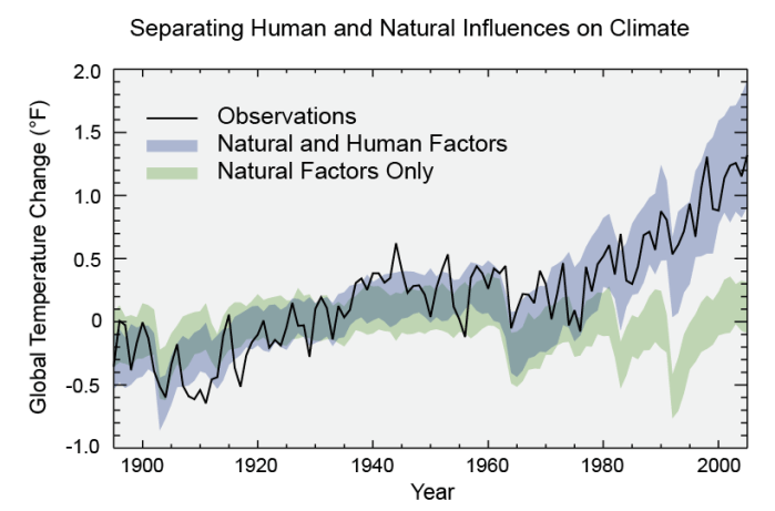
Figure from the report “Climate Change Impacts in the United States: the Third National Climate Assessment” (2014). https://nca2014.globalchange.gov/
In the last few lessons I’ve been talking about climate models and how they can model incredible complexity including energy balance, convection (circulation) in the atmosphere and oceans, and biogeochemical processes. Once we have such models we can do many things. First, the models help us ask questions and test our assumptions. They allow us to explore “what if” scenarios and understand how important certain components of the system are. Second, the models help us to predict the future and third, they allow us to understand what we can, and cannot, influence.
The figure above comes from a US government report published in 2014. It compares two runs of a climate model with observations of “global average temperature”.
The two model runs have a broad shaded area. That represents the uncertainty of the model – it indicates the range that the temperature could be in, based on multiple runs of the model (the so-called “ensemble run”) in which initial starting points (and the sizes of certain effects) are varied from run-to-run in a way that is consistent with our understanding of our lack of knowledge.
Global average temperature is not an easy thing to measure (we’ll come on to that in later lessons), but the black line is the result of our best attempt at combining the data we have. Really it should also have “uncertainty” prescribed to it – I’d prefer to see this graph with a band around the black line too. I don’t know enough about how this value is determined (I’ll try to find out and get back to you!), but my guess is that it has an uncertainty (width) of somewhere between half that of the models and the same size as the models.
The green model band describes “natural factors only”. This runs the model considering all the biogeophysical processes, and also considering the distance between the Earth and the Sun, variations in the solar cycle, volcanos erupting and releasing gases into the atmosphere, trees growing and dying, lightning-caused fires and so on. The blue model band describes “natural and human factors”. It includes all the quantities above, but also includes anthropogenic (human released) fossil fuel burning (coal, oil, gas), cement making, the release of particles in cities (smog, air pollution), refrigerant gases (CFCs and their more modern replacements), methane release in industrial-style farming and landfill waste tips), and land use changes (cities, deforestation). Note that 80% of the observed difference between the blue and green lines is due to fossil fuel burning. The other things make up a further 20% of that.
Until 1980 you can’t tell the difference between the lines. It becomes clear (now, in hindsight) around 1990. But it’s worth remembering that in 1990 our computers were a lot smaller, our climate models a lot less detailed (remember the 1987 storm that the MetOffice failed to predict – that was because the weather forecasts were a lot less reliable then – and the climate models are based on the same programs as the weather models). So while in hindsight it was around 1990 that humans became a driving force in the climate, we’ve only had the science to understand that since about 2010. We are in the very early days of our full understanding of the problem.
I’d like to keep the science and the politics separate, so I’ll write a separate note on my thoughts about this.
In Lesson 9 I make a common mistake of describing scientific progress in terms of increasing complexity. I explained about “early” climate models that were energy balance models, “later” climate models that included the circulation/convection of the atmosphere and ocean and “modern” climate models that include all these things and also chemistry and biology.
Since I wrote that I’ve been realising that this, while a nice “story”, is not really true. Because I am writing these blog posts and then scheduling them for publication a few days later, I realised I could edit the previous lesson before it was published, or write this follow on post. I went for the latter option, because I think the “nice story” is easier to follow. I guess in that way it’s like the model itself – the nice story of a progression of complexity is a simple model of the history of climate modelling and one that is very helpful to explain why models have got better over time. The nice story models some “big picture” stuff, but gets a lot of details wrong. A fuller story will describe the detail more accurately, but will be messier and we’ll lose information. We’ll be “unable to see the wood for the trees” – metaphorically in the case of how I tell the history.
Being literally “unable to see the wood for the trees” is one of the reasons why we still use simple climate models today. A thorough modelling of all the details can sometimes lose something. Earlier in my career I came across the concept of the “missing sunlight” – what this was telling us was that the detailed modelling of where incoming sunlight went (some reflected from clouds, some from the surface, UV parts absorbed by the ozone layer, some lines absorbed by atmospheric gases, some absorbed by the surface to heat up the Earth …) didn’t add up to what the big picture model of “energy in = energy out” was saying. In our forest, the treatment of individual trees misses some of the interactions between trees. There’s a similar “missing water” problem in the Amazon rainforest where the total rainfall seemed twice as big as the outflow of water from the Amazon river system. Later it was realised that water wasn’t just evaporating from the rivers and oceans, it was also evaporating from leaves and being released by trees – and that water was raining down again: a large proportion of the rain was recycled.
For all these reasons, simpler climate models have a very important part to play in modern climate research. They help us understand the processes and test the complex models, they allow for faster “experimental” tests of different processes. They make sure we continue to see the wood as well as the trees.
Conversely, the first attempt at a fully integrated climate model that considered many different complex interactions and treated the calculations in a three dimensional way, was in the 1950s. Computer power was considerably poorer then, and the models were less sophisticated in some ways, but there was an attempt to model all the interactions together.
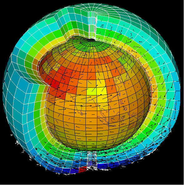
Representation of a Global Climate Model (note this image is in multiple places on the internet but none seem to have the authenticity of being the original version
In the last lesson we learnt about Lewis Fry Richardson developing the concept of numerical weather forecasting. In the 1910s and 1920s his idea could not be realised because we did not have sufficient computing power. Today, that computing power exists – indeed of the UK’s top 7 supercomputers, four are at the Metoffice and two at ECMWF (the European Centre for Medium-Range Weather Forecasting). The only one that isn’t used for weather and climate forecasting is at the Atomic Weapons Establishment (and I dread to think what they use it for).
The weather and climate models of today work as Lewis Fry Richardson predicted: they break the Earth and its atmosphere up into little boxes and in each box they predict the change in conditions over a certain defined time step. They then pass that information to neighbouring boxes.
Over time, weather and climate models have become more complex in:
The range of phenomena that they include in their models (discussed below)
The size of the boxes and time steps (smaller boxes, smaller time steps)
The variety of observational data that they bring into the models
Their handling of uncertainty in the modelling processes and in the observations
Their ability to predict both overall trends and detail (so moving from making predictions for averages to predictions for specific areas)
The human and geological behaviour that they can include in the models (fossil fuel burning, deforestation, volcanos etc).
The simplest climate models are “energy balance models” (EBMs). These do what we considered in our thought experiment in lesson 4, extending it as we did in 4b. They generally split the world into rings of latitude. In each ring they consider the energy in (from the sun based on the average amount of sunlight to hit that ring over a day and a year) and the energy out (the reflected sunlight, which depends on the average albedo – that is reflectance, and the thermal infrared Earth emission and thermal infrared emissivity – that is how well it emits that wavelength). The greenhouse effect is included as a temperature increment – the amount that those greenhouse gases cause a temperature rise. Such models can give basic information about the Earth system – and explain the basic temperature changes that we see.
The simple models can also consider some feedback processes. Since 1969 climate models have considered the “sea-ice albedo” feedback. This affects these energy balance equations near the poles. When the temperature of the Earth is cooler, there is more sea ice and that reflects sunlight back to space, reducing the amount of sunlight that heats up the Earth and therefore cooling the Earth further (this was an important feedback mechanism during the ice age). When the temperature of the Earth is warmer, the sea ice melts and the dark sea that is there instead absorbs a much larger fraction of the sun’s light, warning up the Earth further.
Energy Balance Models can also study the impact of changes in the output of the sun (the sun has an 11-year sunspot cycle and is about 0.3 % brighter when there are more sunspots than it is when there aren’t any. During 1650 – 1700 there was a period of time with almost no sunspots (the Observatoire de Paris was taking records daily) and that corresponds to the “Little Ice Age” (though at the same time there were increased volcanic activity and probably a significant regrowth of rainforest in central America after European diseases, introduced by the explorers, wiped out a very large population – both of those factor may also have altered the climate).
However, energy balance models must be superficial when used alone. Instead they are one component of more complex models. The next, and essential, level of sophistication is to add in convection. I mentioned in an earlier lesson that a garden greenhouse does not heat up because of “the greenhouse effect” but because the glass stops the air circulating. We also know that “radiators” in our houses don’t really work by radiating heat, but by setting up circulation patterns in the air in the room (hot air rises). Similar processes happen in the oceans. London (51 degrees latitude North) is much warmer than Ottawa (45 degrees latitude North) because of the gulf stream that transports hot water from central America towards Europe.
Circulation models need to consider the Earth not in latitude bands, but in the small boxes (including boxes on top of each other into the atmosphere and down into the sea) and consider the currents in the ocean and the winds in the atmosphere and how that means water or air is passed from one box to the next. Circulation models also include physical processes in the ocean and atmosphere – how water vapour condenses into clouds and how clouds precipitate into rain and snow. It is circulation models that model “cloud feedback” which we discussed before.
The gulf stream is driven by salt in the sea water. As water travels from the Equator towards the poles, some evaporates, and therefore the remaining water becomes more salty. Salty water has a higher density (is heavy) and sinks and this sinking drives the “conveyor belt”. There’s a nice video from the MetOffice on youtube that explains this.
One topic that has been discussed in the media (and was the basis of a film) is a concerning possible future feedback could be that as the Greenland ice sheet melts, the fresh (not salty) water introduced just at the point where the Gulf Stream sinks, could stop the whole circulation – changing the patterns across the world and, potentially, making Europe colder! The latest IPCC report, however, says that this is “very unlikely”, though there may be changes in how the circulation occurs.
Modern models “coupled climate system models” include more processes, including chemical processes (chemistry in the ocean, in the atmosphere and at the boundary between the ocean and the atmosphere) and biological processes (growth of trees and algae and the chemical and biological changes that creates: e.g. photosynthesis, carbon storage in trees and in the soil, the effects of fire). They also model human effects – from the “heat island” effects of cities to the impact of paving our roads and gardens on the water cycle.
Modern climate models are some of the most complex computer programs in the world, written by huge teams of experts, each concentrating on one small detail, and running on some of the world’s most powerful computers. They are the achievement of huge multidisciplinary teams of physicists, chemists, biologists (and most importantly those working at the cross-over between disciplines: biochemists, biophysicists), computer scientists, engineers and mathematicians. There are approximately 30 teams of scientists who have developed climate models that run on different computers running different codes. Those teams go to conferences together and learn from each other, but each team makes its own decisions about which details to include and how to model them. They also make different decisions about which observational data (the subject of a later lesson) to include.
The Earth System is extremely complicated. Our models are our best attempt to simulate the real Earth. As our science has become more sophisticated, and as our computers have become more powerful, we have been able to include more and more detail into those models. But we must never forget that they are models and not reality in and of themselves.