
In the last few lessons I’ve been talking about climate models and how they can model incredible complexity including energy balance, convection (circulation) in the atmosphere and oceans, and biogeochemical processes. Once we have such models we can do many things. First, the models help us ask questions and test our assumptions. They allow us to explore “what if” scenarios and understand how important certain components of the system are. Second, the models help us to predict the future and third, they allow us to understand what we can, and cannot, influence.
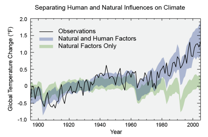
The figure above comes from a US government report published in 2014. It compares two runs of a climate model with observations of “global average temperature”.
The two model runs have a broad shaded area. That represents the uncertainty of the model – it indicates the range that the temperature could be in, based on multiple runs of the model (the so-called “ensemble run”) in which initial starting points (and the sizes of certain effects) are varied from run-to-run in a way that is consistent with our understanding of our lack of knowledge.
Global average temperature is not an easy thing to measure (we’ll come on to that in later lessons), but the black line is the result of our best attempt at combining the data we have. Really it should also have “uncertainty” prescribed to it – I’d prefer to see this graph with a band around the black line too. I don’t know enough about how this value is determined (I’ll try to find out and get back to you!), but my guess is that it has an uncertainty (width) of somewhere between half that of the models and the same size as the models.
The green model band describes “natural factors only”. This runs the model considering all the biogeophysical processes, and also considering the distance between the Earth and the Sun, variations in the solar cycle, volcanos erupting and releasing gases into the atmosphere, trees growing and dying, lightning-caused fires and so on. The blue model band describes “natural and human factors”. It includes all the quantities above, but also includes anthropogenic (human released) fossil fuel burning (coal, oil, gas), cement making, the release of particles in cities (smog, air pollution), refrigerant gases (CFCs and their more modern replacements), methane release in industrial-style farming and landfill waste tips), and land use changes (cities, deforestation). Note that 80% of the observed difference between the blue and green lines is due to fossil fuel burning. The other things make up a further 20% of that.
Until 1980 you can’t tell the difference between the lines. It becomes clear (now, in hindsight) around 1990. But it’s worth remembering that in 1990 our computers were a lot smaller, our climate models a lot less detailed (remember the 1987 storm that the MetOffice failed to predict – that was because the weather forecasts were a lot less reliable then – and the climate models are based on the same programs as the weather models). So while in hindsight it was around 1990 that humans became a driving force in the climate, we’ve only had the science to understand that since about 2010. We are in the very early days of our full understanding of the problem.
I’d like to keep the science and the politics separate, so I’ll write a separate note on my thoughts about this.
