Lesson 8: The first numerical weather forecast

factory
Painting of imaginary prediction factory, based on Ch.11 of Richardson’s ‘Weather Prediction by Numerical Process’, ink and water colour, commissioned and owned by Prof.J.G.Byrne, painted by and Copyright of Stephen Conlin, 1986. Obtained here.

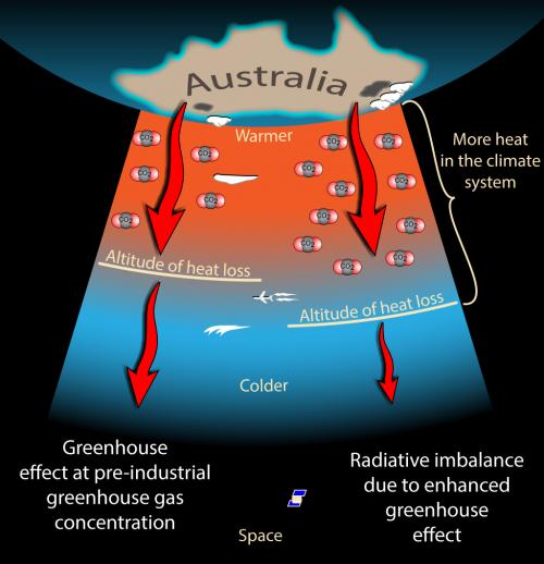
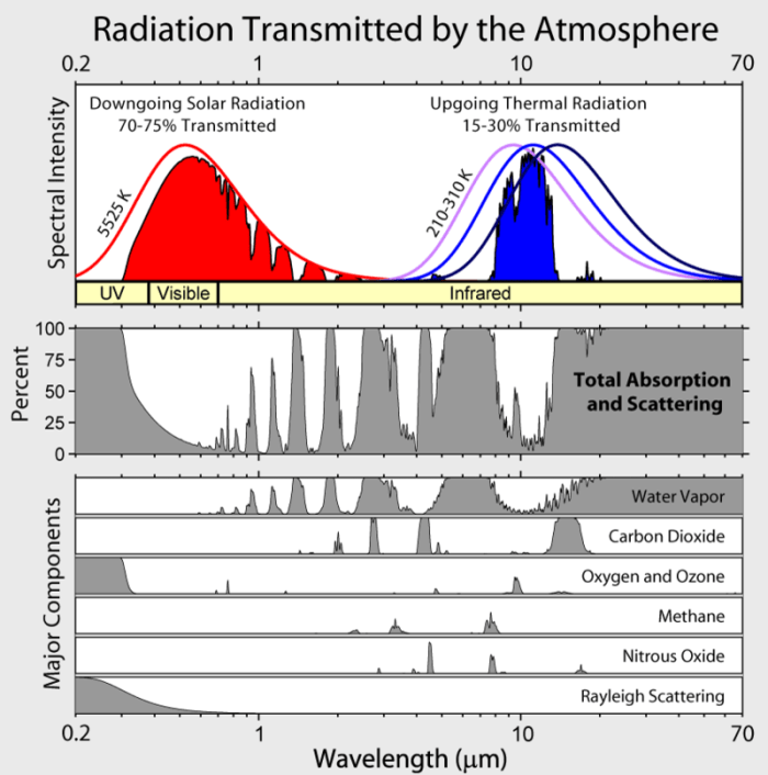
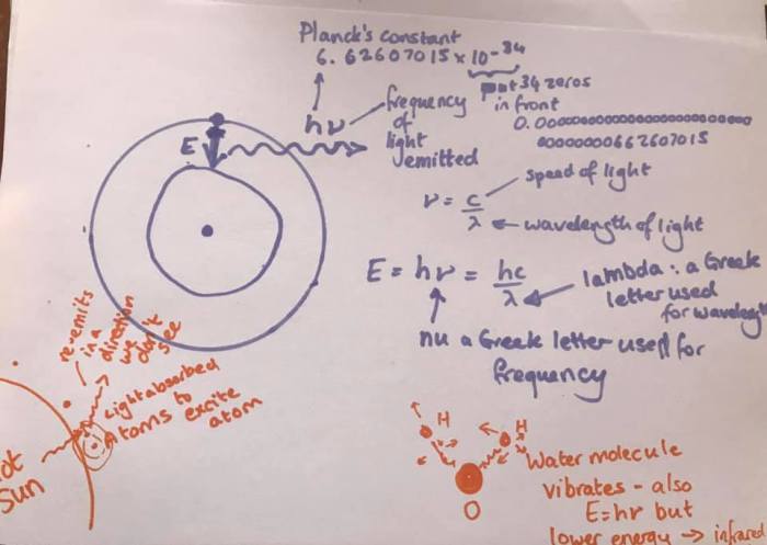
So, we’ve discussed blackbody radiation and how the hot sun emits electromagnetic radiation at short wavelengths (UV, Visible, near IR) and the much cooler Earth radiates in the thermal IR. We’ve discussed how the Earth needs to reach an equilibrium where the incoming energy matches the outgoing energy and how without greenhouse gases that would be achieved at around -18 ºC, but, because greenhouse gases absorb thermal IR to excite various vibrational modes (make the molecules wobble), a lot of the thermal IR gets absorbed in the atmosphere and the Earth warms up.

I hope I’ve expressed two core concepts: these processes are all basic physics and chemistry in and of themselves, but there is complexity in the Earth system because of interactions and feedback loops. It’s not quite as simple as more CO2 means more vibrating molecules and hence more warming: increasing CO2 does cause warming, but to understand how much, you need to understand exactly how the light interacts with all the molecules and how the atmosphere itself radiates and how increasing atmospheric temperature holds more water vapour which also acts as a greenhouse gas. It’s both very simple – and very complicated!

Now, a slight aside to get to how that complexity is handled. Back in World War 1 a young Quaker (this is a subject that brings together both my faith and my science!), Lewis Fry Richardson was working in the Friends’ Ambulance Unit in the trenches. By day he dealt with the wounded and the dying. And at night he solved differential equations. I get that: after the horrors of the day, maths provided the rational logic that helped him control emotions.

What he was trying to do was to make the first weather forecast. He had weather measurement data for an area in Central Europe and he decided he’d try to predict the temperature in one place by using what had happened six hours earlier in other places. He had the concept of the first numerical weather forecast. The idea was simple; he would split his map up into lots of different cells and then in each cell he would know both the current temperature, pressure, wind speed and direction and, crucially, how that was changing with time (what in maths is known as “the differential”). He’d solve the differential equations in each cell and that would pass information to the next cell. That way he could calculate numerically what the weather would be a six hours later in one of his cells. He spent six weeks on his calculations – and ended up with the wrong answer (I know that feeling too!). We now know that his wrong answer was because of problems with the input data (the measurements of temperature and pressure that he had were not reliable enough – we’ll certainly come back to that message since my job is to make sure the measurements that go into models are reliable!)

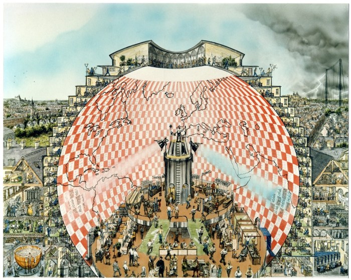
However, his principle was right – you can predict the weather in one place by cutting the Earth up into lots of cells, using measurements and estimates of the current conditions in each place and the rate of change of those conditions, and then solving numerically the differential equations in each cell to show the change until the next time period. He knew that it had taken him 6 weeks to calculate the one cell he was working on, but he imagined that if there were 64000 (human) calculators working together, they could do real time weather forecasting and predict the future. His concept of a “weather forecast factory” (illustrated above) and is exactly what is done in the supercomputers that run today’s weather forecasts.

We’ll go into them in more detail in a later lesson, but basically numerical weather forecast models split the Earth and its atmosphere and oceans into lots of “cells” – boxes that cover a certain longitude and latitude at a particular atmospheric height (or ocean depth). In each box they model the basic physics of radiation (heat, light, temperature) and convection (air/water pressure and winds/water currents) in each box and solve differential equations to show how that is changing over a defined time step. Modern models also model the chemistry (how gases in the atmosphere interact with each, changing salinity and pH of the oceans) and biology (growth of plants and algae, respiration) as well as the large scale geoscience (sun irradiance changes, volcanoes, …).

Numerical weather forecasts are some of the most complex computer programs in the world, being run on some of the biggest and most powerful computers in the world.

The “short term weather forecast” models (which can accurately predict ~3-5 days), the “medium term weather forecasts” and the “climate forecasts” all run exactly the same model at the UK MetOffice – they just use smaller cells and do the calculation on a much finer time scale for weather forecasting and use bigger cells and averages over a month on the climate forecasting. Each meteorological office has its own model developed by its own scientists and programmers – and even within one meteorological office they may have multiple variations of their model. That’s how they can say “there’s a 70% chance of rain” – what they mean is that when they ran their model many times with minor changes to account for what they didn’t know, 70% of the models put out rain and 30% didn’t.

Now I know what you’re thinking! If you’re British and older than 40 you’re remembering Michael Fish on the BBC saying there wouldn’t be a hurricane the day before the 1987 storm. I remember that day vividly as I tried to cycle to school around the fallen trees and got there to find school was closed – which is sort of the point – I couldn’t check in advance if school was closed because there was no (well no established) internet: computers were significantly less powerful back then. The weather forecasts of today are much more sophisticated and much more accurate. But, granted, they are only accurate for around 3-5 days (and we all know there is a limit – the famous “butterfly effect” that means minor changes make big differences to a chaotic system – so we can’t predict more than about 10 days ahead, no matter how sophisticated our models and how powerful our supercomputers).

So how can we predict climate with the same models? The reason for that is that with climate we’re asking a somewhat different question – instead of asking “what will the temperature be at Heathrow at 10 am on the 3 June 2080?” we’re asking “what will the average temperature be for all Junes in the 2080s in outer London?” That’s a different question – and ones the models, with bigger cells and more time averaging, can answer.

Aside on Lewis Fry Richardson

When I started this blog as “Scientific Quaker” back in 2016, I intended to write about science and faith (and some of the earliest posts are about the difference between religious and scientific truth and include my thoughts on faith). When people started asking me to move the Climate Lessons to a blog I did think about whether to start a new one or continue with the 2016 blog and eventually I chose to continue here.

But now my Climate Lessons have got onto Lewis Fry Richardson, I feel I can indulge myself in discussing this other “Scientific Quaker” and the difficulty of choosing between faith and career. (For what he did scientifically see here: Lesson 8: The first numerical weather forecast)

I don’t know a lot about him, beyond what is easily available on online searches, but I’d like to share what I do know.

Both “Richardson” and “Fry” are big Quaker names and I’m guessing he was brought up in families that had been Quaker for generations. In the 19th century, Quakers couldn’t go to university, and intelligent Quakers set up businesses instead. His father was a successful leather manufacturer. That had changed by the turn of the 20th century, though, and Lewis Fry Richardson went to Durham and then Cambridge Universities.

He did several different jobs – he was a generalist who found it hard to find the subject that really spoke to him – but eventually he settled in the Meteorological Office where he started to think about weather forecasting. In those days forecasts were based on pattern recognition – in other words they would find the last time the weather map most closely matched today’s map and then assumed that tomorrow’s map would be what the day after that last one was. Richardson realised that it might be possible to predict the weather based on an understanding of the physics behind the processes instead.

image-2-richardson_lewis_1_f_01
Lewis Fry Richardson’s Friends’ Ambulance Unit personnel card. From: http://engineersatwar.imeche.org/features/friends-ambulance-unit

In January 1916 Britain introduced conscription when they realised that the war was going to go on far longer than earlier optimism had suggested. Quakers generally do not believe that any violent conflict can be compatible with a Christian faith and the young men of Britain’s Quaker meetings struggled with the decision of how to respond to the Peace Testimony of their faith and the conscription law. Some Quakers became absolute conscientious objectors – refusing any form of military activity and going to prison for these beliefs. A small number felt that their conscience required them to fight with their fellow countrymen. The majority of Quakers, though, joined the “Friends’ Ambulance Unit” which was created in 1914 as a response to the horrors of casualties in the war. The Friends Ambulance Unit served in both world wars to treat the injured of all sides – and after the second world war in helping displaced people and people released from concentration camps. (My grandmother’s cousin also served in it in the second world war).

At the end of World War One, Lewis Fry Richardson returned to the Meteorological Office, but in 1920 it became part of (what was to become) the Airforce, and he felt he had to resign. (It remained linked to the Ministry of Defence until 2011, when it became linked to the governmental department BEIS: when I graduated in the late 1990s intentionally ignored adverts for the MetOffice for the same reason that Lewis Fry Richardson did).

He did, however, write up his thoughts on weather forecasting in his book Weather Forecasting by Numerical Methods, which he published in 1922 and he worked on new ideas – but he destroyed all his work when he realised the military could use it to predict where poisonous gas bombs (chemical weapons) would disperse.

Instead, he applied the same concepts to trying to predict the likelihood of war – using equations to understand how much countries were preparing to fight each other. For those calculations he had to work out the length of the border between two countries – and that’s when he realised that borders were fractal (if you make your straight ruler shorter, it goes round more wiggles, and the border is measured as longer). But other than a few details like that (his fractal borders were described in the famous 1967 paper by Benoît Mandelbrot who developed the concept of fractals more generally), Richardson’s work in predicting the chance of war was ignored by everyone (I understand a few modern researchers of peace studies are looking at it now – Lancaster University now has a “Richardson Institute” for Peace Studies named after him). He ended up being a physics teacher in a tech college – the only job he could get with his record as a conscientious objector and his unwillingness to work for the MetOffice.

This story challenges any Quaker working in science today. In hindsight it seems a huge waste of his talents for him not to have worked for the Met Office. And yet, the Met Office was heavily involved in decisions in World War 2 that chose the best dates for bombing civilians in Germany. They still are used for the military. However, his resignation did not stop any of that happening.

I have always refused to work on military projects and, fortunately, that has had no real impact on my career (and has even got me out of a few projects that went wrong). But there are always grey areas. I’m setting up a large consortium at the moment that involves lots of scientists working on the observations that form the basis of climate models – and there are scientists from the navies of two countries who have asked to join the consortium.


Lesson 7: Carbon dioxide as a greenhouse gas

Lesson 7: Carbon dioxide as a greenhouse gas
CO2_H2O_absorption
Photo found on web, attributed to Robert Rohde’s “Global Warming Art” which I can’t find a live link to.

I showed the picture above in the previous lesson and discussed how water vapour absorbs a very broad set of wavelengths in the thermal infrared (and a few in the near infrared). This absorption is due to how the light of those wavelengths causes the water molecules to change their vibrational modes in lots and lots of different ways.

The carbon dioxide molecule has three atoms arranged in a straight line: a carbon atom in the middle and two oxygen atoms either side. It doesn’t have quite as many ways of vibrating as water, but it has quite a few – and crucially different ones (pink in the diagram above), so it absorbs thermal infrared at wavelengths that water vapour cannot respond to. Thus, carbon dioxide removes even more wavelengths that the Earth can use to cool down in outgoing radiation.

In the last lesson, I also described the water feedback loops – simplistically if there’s too much water vapour in the atmosphere it rains. More completely, a higher temperature means both more water vapour in the atmosphere as hot air holds more water – creating more heating – and it means more clouds which may either accelerate warming (trapping heat in at night), or slow down warming (reflecting more sunlight in the day time) – but we’re not quite sure which.

We are increasing the amount of carbon dioxide in the atmosphere (we’ll come back to the evidence for that later – but basically, for most of the last ten thousand years there were 250-280 carbon dioxide molecules in a million air molecules and now there are 400). And there isn’t a feedback loop as simple and immediate as “rain” to get rid of it. There are ways it can naturally come out of the atmosphere: the main ones are increased plant growth (eg in rainforests) and increased ocean algae. The oceans can also absorb some carbon dioxide, but that makes them more acidic which impacts marine life – particularly corals. Of course, if we’ve cut down the rainforests (which we really have) they can’t absorb as much carbon dioxide either.

Because I’m still taking about the basic physics, I want first to consider what the increased carbon dioxide (wherever it comes from) does.

Now you might think that’s easy – CO2 is a greenhouse gas so more CO2 means more warming; but that isn’t directly true. The atmosphere is very thick – so the thermal infrared meets lots of carbon dioxide molecules on the way up: that means that the atmosphere already absorbs all the light at some wavelengths (the ones where the graph above touches the top of the image). Increasing the concentration of carbon dioxide might make it be fully absorbed slightly earlier, but you can’t be more absorbed than fully absorbed (and at some wavelengths it only takes 25 metres of air to block the light completely).

Instead there are two important effects. The easier effect to understand is that not all infrared wavelengths are completely blocked by the atmosphere. In the last lesson I showed a graph of atmospheric absorption zoomed in and there you see lots and lots of thin lines. As the concentration of carbon dioxide in the atmosphere increases, some of those lines get broader, and some of them get deeper. For example, some wavelengths represent changes from an unusual vibrational mode to another, that are rarely “set up” – it’s rare for the light to meet a molecule in the right starting state, but when there are more carbon dioxide molecules, the light is more likely to find one of these rare molecule vibrational states, so those wavelengths are more frequently absorbed and the absorption line deepens.

The more subtle effect is that the atmosphere itself is also lots of little blackbodies radiating thermal infrared blackbody spectra that depends on the temperature of the gases. (As the thermal infrared radiation is absorbed by the carbon dioxide and water vapour in the atmosphere it heats the atmosphere up).

At low altitudes, any infrared emitted by the atmosphere is absorbed by the carbon dioxide molecules and can’t make it through. But there is a height where the atmosphere can radiate to space because there aren’t enough carbon dioxide molecules above it. Increasing the concentration of carbon dioxide means more molecules throughout the atmosphere and therefore this level has to go up towards space (at the lower height where light once could escape it now is more likely to hit other molecules and therefore not escape). Since the higher parts of the atmosphere are colder, there is less energy escaping to space than would be there at lower levels (smaller blackbody curve at lower temperatures) – so the planet loses less heat.

co2SaturationMyth_Atmosphere_med
Image from: https://skepticalscience.com/graphics.php?g=104

Eek. Sorry. I could have over-simplified this: more CO2 means more greenhouse warming. But I want to try to explain the whole story as I understand it (I am not an expert on climate modelling, so there are still huge simplifications in here I don’t know about!)

One last point: water vapour and carbon dioxide are not the only greenhouse gases. Methane is another important one – with four hydrogen atoms round a carbon atom, it has a lot of vibrational modes – but there’s not as much of it in the atmosphere as there is carbon dioxide. It is also increasing. The refrigerants (HFCs, HCFCs, CFCs) don’t only damage the ozone layer (ozone has vibrational modes that block UV on the way in) but are also very potent greenhouse gases – partly because they don’t occur naturally so they absorb wavelengths nothing is absorbing already. There are currently very low levels of these, but if we don’t dispose of our old refrigerators and air conditioning units carefully we’ll release them into the atmosphere and because there is no absorption at these wavelengths already – a small increase makes a big difference. Just think about how many air conditioning units there are – and the human feedback loop: more warming, more air conditioning, more refrigerant gases, more warming… (that’s why Project Drawdown puts disposing of refrigerant gases carefully as their number 1 activity for solving climate change problems).

Lesson 6: water vapour absorption

CO2_H2O_absorption
Photo found on web, attributed to Robert Rohde’s “Global Warming Art” which I can’t find a live link to.

The image above shows the “absorption spectra” of H2O (water – in blue) and CO2 (carbon dioxide – in pink). The absorption is because light (electromagnetic radiation) at each wavelength causes the water or carbon dioxide molecules to change their vibration from one way of vibrating to another. Because water has so many different ways of vibrating, a very large number of wavelengths are absorbed. You can see that the edges are “jagged” – actually, if you zoom in on any one part of the spectrum, you can see that it’s actually made up of lots and lots of lines.

trans10
(Image from: http://www.gemini.edu/sciops/telescopes-and-sites/observing-condition-constraints/ir-transmission-spectra, showing the absorption spectrum of the atmosphere above a mountain for two levels of water vapour in the atmosphere – almost none in black, and a bit in blue-green). Note the picture at the top is about absorption whereas, this graph is for transmission – so where this is high, there is low absorption and vice versa.

The top image has a wavelength scale in microns (micrometres – 1000 times bigger than the nanometres I’ve used so far). The sun’s spectrum is in the wavelength range from 0.3 microns to around 3 microns. The Earth’s thermal infrared emission spectrum is from 4 microns to 40 microns.

The dominant greenhouse gas is water vapour. Water vapour absorbs more infrared radiation than any other gas because of the many, many different ways the molecule can vibrate. And because that radiation (light) is absorbed, it doesn’t get released into space and the Earth has to heat up to maintain a thermal balance between the incoming solar radiation and the outgoing thermal infrared radiation.

So, what would happen if all 7.5 billion of us boiled a kettle and released water vapour into the atmosphere simultaneously? Well, the simple answer is – it would rain. The atmosphere can only hold so much water (the exact amount depends on temperature and pressure) and when it’s exceeded, the water condenses into clouds and, eventually, rain. The water cycle is a very complex, but also very rapid feedback loop. The exception would be if we boiled those kettles in the upper atmosphere. There it is harder to make clouds, and the extra water vapour creates significant increased warming. This is one of the problems with aeroplanes – they are not only creating carbon dioxide, but also releasing water vapour into the high levels of the atmosphere.

The aeroplane effect is more complex still – aeroplanes burn fuel and the by-products are carbon dioxide, water vapour and nitrous oxides – all greenhouse gases. Emitting water at high altitude creates increased warming – but this, too, eventually falls as rain. The carbon dioxide has a much longer lifetime. If we all stopped flying, the water vapour would disperse quickly – the carbon dioxide would stay around for decades. Note that if we powered our planes with hydrogen, they would still emit water. (See also: this Guardian article from 2010). Of course, planes also make contrails – which means more clouds (see comments below about clouds).

However, hotter air can hold more water than colder air. So if the air temperature increases (for whatever reason), there is more water vapour in the atmosphere, which in turn leads to more “greenhouse effect” heating. This is known as a “positive feedback” – positive in the sense that it makes the effect bigger, rather than that it’s a good thing!

We don’t have a lot of global records of water vapour levels, so it’s hard to put precise numbers on the amount of water vapour in the atmosphere and how that’s changing with time. But there are indications from spot measurements (where it’s been measured in one place for a long time) that water vapour is increasing as the atmospheric temperature increases.

Of course, increased water vapour also leads to more clouds and we’re still not completely sure what more clouds means for the climate. On the one hand, more clouds means more sunlight is reflected – reducing the incoming energy and therefore cooling the Earth. On the other hand, more clouds means that more heat is held in at night (we all know clear nights are the coldest), therefore heating the Earth. For clouds at high altitudes we know that the keeping heat in is the bigger effect (positive feedback), for clouds at low altitudes, reflecting sunlight is a bigger effect (negative feedback). Overall, there’s a lot of uncertainty in what we understand about both the positive and the negative feedback mechanisms. The latest IPCC report concluded that the positive feedback was likely to be more significant than the negative feedback – but it’s still not clear by how much. “Cloud feedback” is the biggest uncertainty in climate models (and better satellite data is needed to improve our understanding of it). The climate modellers have been predicting that doubling the carbon dioxide will change the Earth’s temperature by “something between 1.5 ºC and 4 ºC”. The reason they give a range is almost entirely due to our lack of  – almost all of that range is caused by our lack of understanding of cloud feedback. As we improve our understanding of clouds, we’ll reduce that range (and recent studies suggest the lower end of that range was too optimistic).


Lesson 5b: More on atmospheric absorption

800px-Atmospheric_Transmission

This image comes from the Wikipedia article on the greenhouse effect.

The red bit is the sunlight coming down. The drawn line is roughly what’s at the top of the atmosphere (there is some loss because of Fraunhofer lines, but basically it’s a perfect blackbody) and the coloured in red bit is what reaches the Earth’s surface. The missing wavelengths are absorbed – and you can see below why:

  • UV and blue are absorbed by ozone in the upper atmosphere and “Rayleigh Scattering” (the thing that makes the sky look blue in the daytime and red at sunset).
  • The near infrared (sunlight with wavelengths too long for us to see) is absorbed mostly by water vapour (and a few wavelengths by carbon dioxide) (more to come)

The blue and purple lines are what the Earth would emit at different Earth temperatures (the one most to the left is for a blackbody at 310 K – or about 35 ºC – the one furthest right for temperatures around 210 K – or about -63 ºC). The solid blue bit is the only bit that gets through the atmosphere. All other wavelengths are absorbed by water molecules (“water vapor” plot) or by carbon dioxide or other greenhouse gases.

The diagram is drawn for a normalised blackbody curve – so you can see the thermal infrared one and the solar one on the same picture. In reality the solar one would be much “higher” as well – and the blue ones would not only shift left with higher temperatures, but also get taller.

Because so much of the output spectrum is absorbed, the Earth will heat up until it’s output is equal to its input: it needs to be at a hotter temperature for the energy in the coloured in blue bit to be equal to the area under the whole curve at a lower temperature.

This is known as the ‘greenhouse effect’ – but that’s actually a poor name. Yes, there is some real “greenhouse effect” in a greenhouse: the sunlight gets through the glass, but the thermal radiative energy of the surfaces in the greenhouse, emitting thermal infrared radiation, can’t get back out again … but actually the main reason real greenhouses warm up is that hot air can’t escape… ah well!

Lesson 5: Atmospheric absorption

So in Lesson 4, we learnt that if the Earth had no atmosphere, but still reflected about the same amount of sunlight as it does now, it would be at about -15 °C to -20 °C on average to be in “thermal equilibrium” where the energy coming in from the sun matched the energy coming out through the Earth’s own, thermal infrared, blackbody radiation.

Of course, we all know from our personal experience that the average temperature of the Earth (averaged over the whole Earth, whole day, whole year) is a lot hotter than that. So what is it that the atmosphere does?

To think about that, let’s start with a revision of Lesson 3 about light being absorbed and emitted by atoms. First, the “electromagnetic spectrum” is what I drew in lesson 1: it is the “rainbow” in the visible, and extends that to other wavelengths of electromagnetic radiation. If you look at the visible spectrum (the rainbow) of the sun, you see black lines in the spectrum. These are known as Fraunhofer Lines after the scientist who first described them (see lesson 3b).

Light coming from inside the sun “excites” an atom in the outer parts of the sun, which means that an electron goes to a higher orbital. Then, when the atom returns to its lower state, it releases light with the same wavelength: but it does so in a random direction. So the amount of light heading towards us decreases at that wavelength and we see a black line in the solar spectrum.


In the Earth’s atmosphere the same thing happens – both on the way down and on the way up. Every atom has its own set of lines where it absorbs. But additionally, molecules can absorb lines too. In the atom case, the absorbed energy from the light is used to move a very light-weight electron up to another orbital inside the atom. With molecules, the absorbed energy from the light makes the molecules vibrate in new ways. Since in molecules the things moving are much heavier atoms (rather than very light electrons), all this happens with a lower frequency – and molecular absorptions are in the thermal infrared.

Incoming light from the Sun reaching the top of the atmosphere is in the UV, visible and near infrared spectral region. The UV is absorbed by atoms (and some molecules like ozone) this light gets re-emitted but in all directions, including out of the atmosphere, and is lost. That’s how our ozone layer protects us from harmful UV. Other visible wavelengths are absorbed by the atmosphere too – some Fraunhofer lines are due to atoms in the Sun, others are due to atoms in our atmosphere. This means that some wavelengths do not make it down to Earth.  But this absorption is only a few lines, and it doesn’t affect the overall amount of energy reaching the surface very much.

The Earth’s emitted radiation is in the thermal infrared. This longer wavelength (lower energy) light gets absorbed by molecules to make them vibrate in lots of ways.

Wikipedia has some great images of water molecules vibrating:

The yellow ball is the oxygen. The blue balls (which should really be much smaller than the yellow ball) are the hydrogen atoms (H2O!). Imagine you were holding a model of this with springs for the bonds and balls for the atoms. You can imagine that there are lots of ways for the molecule to vibrate and rotate. Each transition from one way of vibrating to any other way of vibrating requires just the right amount of energy supplied through light at “just the right wavelength”. So you can imagine there are lots and lots of thermal infrared wavelengths that get absorbed by all the water molecules in the atmosphere. And, while that light can also be re-emitted, that will be in any direction – including straight back down to Earth and into the path of another molecule.

[Actually, because the water molecules aren’t cold themselves, they are already doing some vibrations of their own – this actually leads to even more wavelengths being “just right” to create transitions between different vibrational modes.]


There are some difficult concepts in here, so I’ll stop and add give space for questions. 

Lesson 4b: Further thoughts on the temperature of the Earth

The ideas developed in Lesson 4 are the basic “radiative balance” that make up the Earth’s “energy budget” (look up radiative balance or Earth’s energy balance on Wikipedia as a starting point). This is all based on a very simple concept – if an object has more energy coming in than going out, it will heat up, until the energy in balances the energy out. Similarly, if an object has more energy going out than coming in, it will cool down until the energy out balances the energy in. All physical systems try to maintain an equilibrium. In the Earth system, the energy “in” is coming from the Sun, the energy “out” is coming from the Earth’s own blackbody radiation – and the hotter it is, the more it is radiating out.

I’ve considerably over-simplified the problem in the example in lesson 4 (and not just by ignoring the greenhouse gas effect – which we’ll come onto next).

First, I’ve ignored any heat generated by the Earth’s core, which does work its way up to the surface (hot springs and geysers). This is ok, though, the heat that comes up from the core is about 0.03 % of the energy that comes from the sun. That is much smaller than the size of the approximations I’m giving above.

Second, to improve this calculation you’d have to properly know the average reflectance in the solar reflective spectral region (from UV to short wave infrared). That’s called the “Earth’s albedo” and will vary from something very high (clouds, snow) to something very low (deep ocean, dark forests). It’s generally assumed that the average albedo is somewhere between 0.2 and 0.4 (search it yourself if you want).

You also need to know the Earth’s emissivity in the thermal infrared. Generally natural surfaces have a high emissivity in the thermal infrared – around 0.8 (low end of shiny snow ice) – 0.96 (deep water), with stone and mud around 0.9. (see: https://www.jpl.nasa.gov/spaceimages/details.php?id=PIA18833). So my calculation should be more like 340 × (1 – 0.3) = 0.9 × σT4. That gives a temperature of 261 K, or -12 ºC.

Third, I’ve ignored the effect of atmospheric and ocean circulations that move the energy around the Earth (though that’s ok with my “no atmosphere” approximation).

But my basic premise holds: without greenhouse gases (next lesson we’ll talk about what they do), the Earth would be really, really cold – with average temperatures in negative teens.  

Before we leave this simplification, it’s worth thinking about what you’d do to do this simple calculation better. You’d probably split the Earth up into little boxes. In each box you’d work out what the average energy (over a day, over a year) coming in from the Sun would be (higher at the equator than at the poles). And you’d work out how much was reflected (more over ice and sand than over ocean or forest) and what the thermal infrared “emissivity” is (i.e. how well that type of surface emits thermal infrared radiation). Then you’d do the energy balance equation in each box and then add that all up for the whole Earth. That would be the beginning of a climate model (more later!)


Lesson 4: the temperature of the Earth

temperature of the earth

In this lesson, we’re going to do what physicists like to do – we’re going to over-simplify the Earth and do a “thought experiment”.

So, we’re going to imagine that the Earth doesn’t have an atmosphere and we’ll work out what temperature it “should be”. This builds on the lesson on blackbodies.

First, the Sun is sending light towards the Earth. The Sun is very hot and emitting light in all directions, but the amount of energy coming directly towards the Earth (the solar irradiance) is 1360 W / m2 (ish – we’ll come back to how we measure this later). But that’s the light coming towards the Earth and, of course, half the Earth doesn’t get hit at any one moment (it’s the night time) and towards the poles, that 1360 W gets spread over a much bigger area of Earth.

To understand that consider 1 square metre rings in a row in front of the Earth (top picture): over the equator the light going through those rings forms a circle on the Earth; but over the poles, it would be spread over a much bigger ellipse. So – the average power falling on a square metre of Earth’s surface at any one time (averaged over the whole Earth) is about 1360 / 4 = 340 W / m2 (watts per square metre). That’s like having 4-old fashioned lightbulbs on every square metre of the Earth.

Now, the Earth can’t get hotter and hotter and hotter! It will reach an “equilibrium” where the heat in equals the heat out. (Equilibria are very common in physics). The way it releases energy into space is via its own blackbody radiation. You may remember from our lesson on blackbodies that everything that is hotter than absolute zero radiates energy with a blackbody curve. And that is true of the Earth too. As the temperature of the Earth is quite low (compared to the Sun!), it will radiate most of its blackbody radiation in what we call the “thermal infrared” (long wavelengths).

We can work out the total power of the blackbody by working out the area underneath that curve. There’s a simple calculation there. The total power of a blackbody in a square metre of its surface emitted into space is sigma times Temperature to the power 4. (σT4. Sigma (σ) is the Stefan-Boltzmann constant and is 5.670 367 × 10-8 W m-2 K-4 .

If the Earth were perfectly black at both short wavelengths (visible, near infrared – the wavelengths the Sun emits) and at long wavelengths (thermal infrared – wavelengths the Earth emits), then we could write:

Incoming power in a square metre = outgoing power in a square metre

340 = σ × T4

So the temperature = 278 K = 5 ºC.

(To do this calculation yourself, remember that the Stefan-Boltzmann constant can be written with the decimal place moved 8 places, so 0.000 000 056 704 and to get from Temperature to the power 4 is something to Temperature is something you can press the square root button twice)

If, as is more realistic, the Earth has an average reflectance in the visible of 30% (so it reflects about 30% of the light from the sun straight back to space and absorbs 70%) but it is still perfectly black in the thermal infrared (not unreasonable), then

Incoming power in a square metre = outgoing power in a square metre

70% × 340 = σ × T4

So Temperature = 254 K = -18 ºC

Now, we have made A LOT of approximations here. The actual average reflectance of the Earth might not be quite 30%, and it’s not quite perfectly black in the thermal infrared – but the basic picture holds. If the Earth had no atmosphere at all, the average temperature across the whole world would be something close to -15 ºC to -18 ºC.

And just in case you think I’ve pulled the wool over your eyes, I thought I’d find out the average temperature of the moon – after all, it’s about the same distance from the sun as us and it’s about the same sort of reflectance. So I searched the internet for “average temperature of the moon” and found an answer here: https://socratic.org/questions/what-is-the-average-surface-temperature-of-the-earth-s-moon

I was most amused that it said:

“You could take an average of the mean maxima and minima to get a mean surface temperature of -23 °C, but it wouldn’t be very meaningful.”

I beg to differ – that is very meaningful – as it’s very close to what I calculated with my overly simplistic thought experiment. (The moon reflectance is a bit different and it’s fraction pointing towards the sun is perhaps a bit different and the average temperature is not necessarily the average of the minimum and maximum temperatures)

Of course, the reason that the average temperature of the Earth is not that cold – and is nearly 35 ºC hotter – is that we do have an atmosphere. But you might be surprised to know that if our atmosphere was 100% oxygen, nitrogen and argon (and not 99.9 % oxygen, nitrogen and argon) it would still be -18 ºC. I’ll explain why in the next lesson.


Lesson 3b: More on the solar spectrum lines

Source: N.A.Sharp, NOAO/NSO/Kitt Peak FTS/AURA/NSF
Published: November 30, 2017

390_highresolutionsolarspectrum1200w

I was asked:

‘In the sun’s spectrum there are black lines at special wavelengths’
This threw me a bit, and so in the continuing paragraph I also got confused. The ‘spectrum’ is the range of light yes? I’m not sure why there are black lines in there. And so then are these black lines acting as blackbody? Are the black lines matter? or more electromagnetic waves?

So let me explore that a little more.

The spectrum is the rainbow – but extending beyond the visible. It’s the light spread out in different wavelengths. Above is the photo NASA took of the spectrum from the top of a mountain in Arizona, USA. Note that really it’s one line going from red to blue, (it’s not 2D – they just made it that way to fit on a page!). The colour you see is the spectrum from about 800 nm (top left) to about 400 nm (bottom right) – the visible part of the solar spectrum. (Note that the solar spectrum actually goes from about 200 nm in the UV to about 3000 nm in the infrared – but we can only see this little bit of it).

You also see black lines in the spectrum. These come from gases either in the outer part of the sun or in our own atmosphere that absorb light with particular wavelengths because that light has exactly the right energy (E = h nu) to make an electron jump from one orbit to another. Later the atom might release that energy going back down again – but, this is the crucial bit, it won’t do so in the same direction that the light was going in in the first place (and sometimes that will then cause another atom’s electron to jump up). So less light gets to us at those wavelengths than should – and we see black lines in our spectrum.

Lesson 3: My favourite equation

E=hnu picture

When I was 17 and doing A’level chemistry I learnt the equation E = h nu. This was the most exciting science lesson of my life. Seriously. I was only disappointed that chemistry rather than physics gave me that gift 😂

You see, I’ve always been fascinated by colour – the mixture of a prism for my tenth birthday and my dad being colourblind (a condition one of my two sons has inherited from the x-chromosome I got from my dad: the other son got the x-chromosome I got from my mum) meant that I really wanted to understand how “colour worked”. Now there are three bits to that – understanding our eyes (a detour I won’t go down now), understanding blackbodies – which explains white light – where lots of wavelengths are present, which we covered before, and understanding E = h nu which explains lights being coloured in and of themselves.

What this equation shows is how atoms interact with light. You’ll remember the simplified model of an atom with a central core and electrons in rings around it? Well, when an atom is “excited” the electrons can go up to a higher orbital. And when they fall back down to the ground state (the state where all the electrons are as close to the nucleus as possible while obeying the rules of how many electrons can be in each orbital) they release energy (based on the size of the jump) as light and the frequency of the light (nu) is proportional to the energy jump. So the bigger the energy of the jump, the higher the frequency of the light (more blue, less red).

You can see this yourself. Drop salt into a flame and the heat of the flame will excite the sodium atoms in salt to a higher energy state. As they fall back down they release yellow light. You might recognise that yellow light if you remember sodium street lights. In those electricity excited the sodium atoms. (Go on, try it!)

In the sun’s spectrum there are black lines at special wavelengths (called Fraunhofer lines). That is this process in reverse. The outer part of the sun is cooler than the inner part and absorbs light to make electrons jump up to higher orbitals. So the blackbody light from inside the sun (all wavelengths) loses light at the special E = h nu wavelengths. Of course those do re-emit those wavelengths as they drop back down, but here’s the crux: they re-emit in all directions including back towards the middle, so the amount of light coming towards us is lower.

This is how helium was discovered – they could match most Fraunhofer lines to lines they could get by putting elements into flames – but there were a set of lines they couldn’t match, so they proposed a new element – helium. (From Helios). Later they found helium on Earth. This is also how neon lights work – different jumps in neon give the different colours of neon light.

Now atomic lines are high energy so they tend to be in visible spectral bands. Later we’ll see that molecules have absorption/emission lines too. These are not from electrons jumping but from the molecule wobbling. Because whole atoms have to move the energy is much lower (heavier things don’t move as easily). So these lines are in the infrared.

But we’ll come back to that.